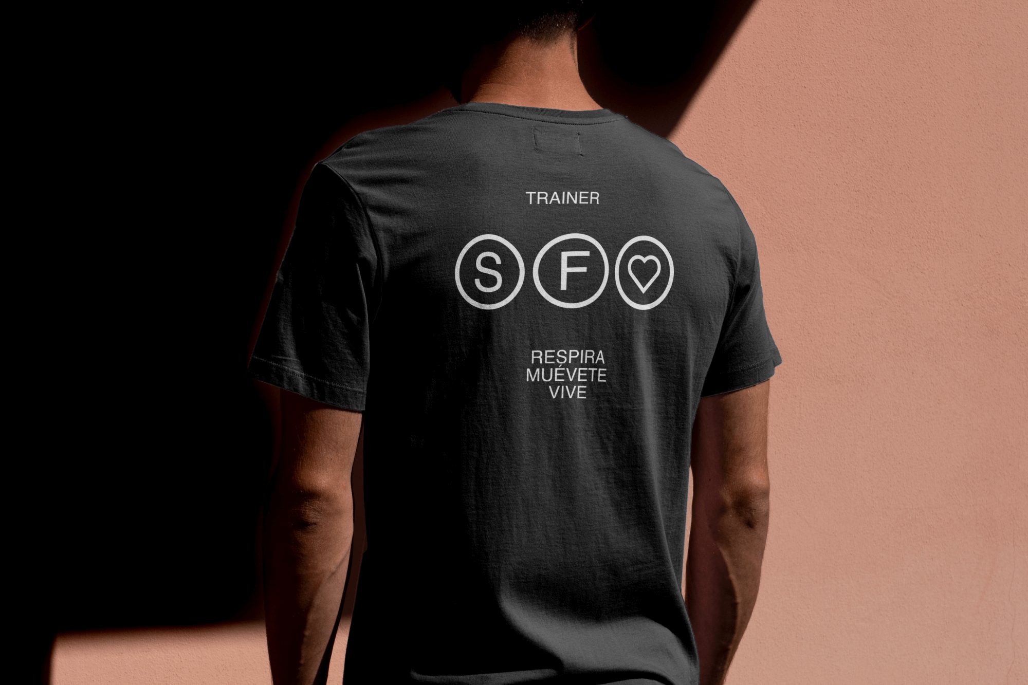
We created a clean visual identity centered around an iconic logo and crisp typography to elevate the brand above the typical clichés of the fitness industry.
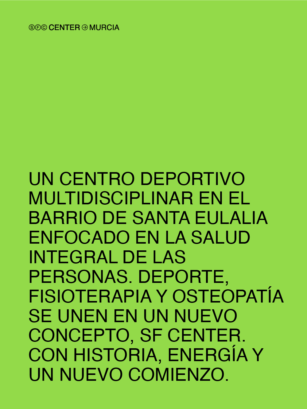
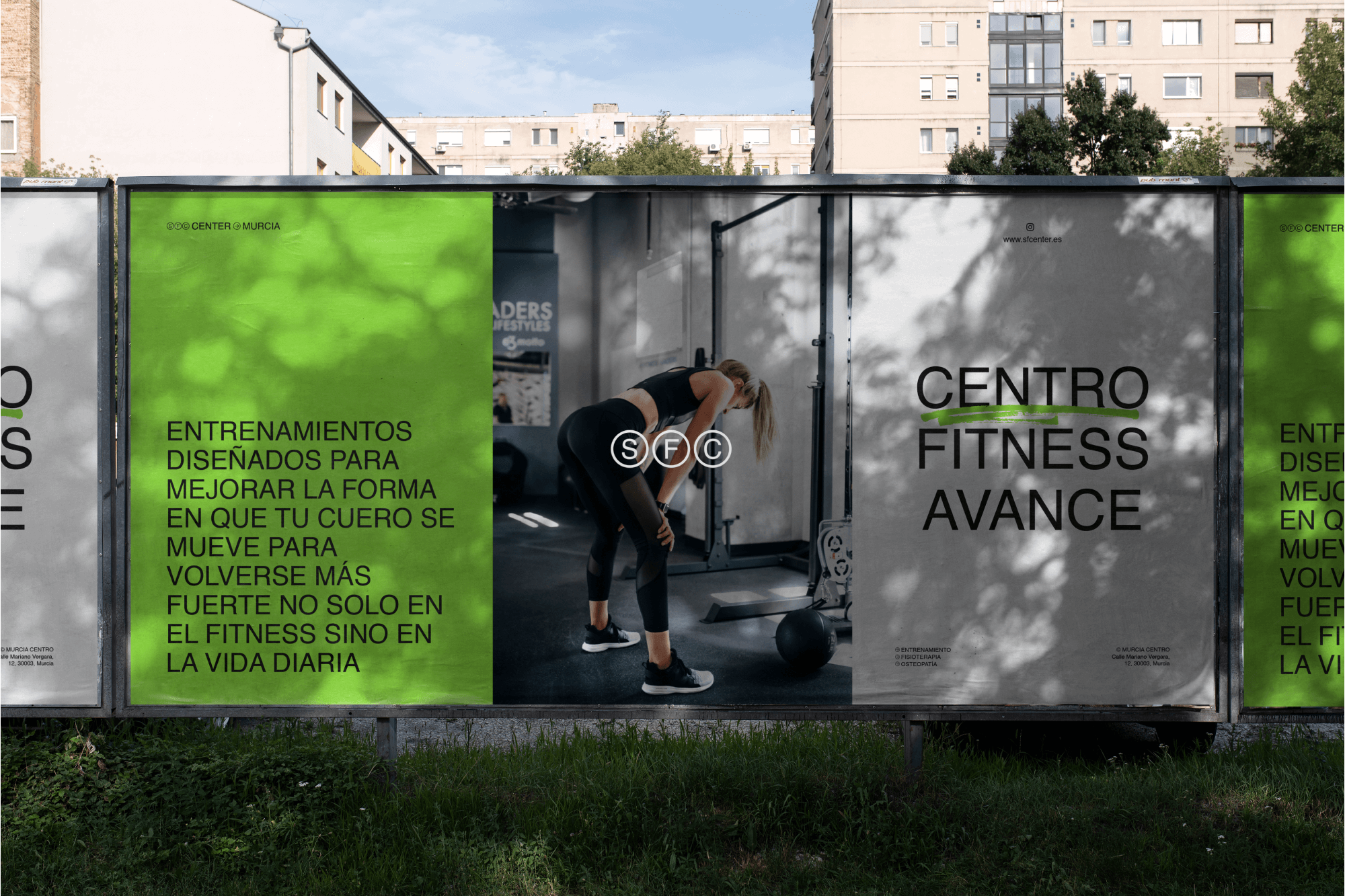
The brand is both simple and iconic, and it is used consistently throughout the system, which will gradually build recognition over time.
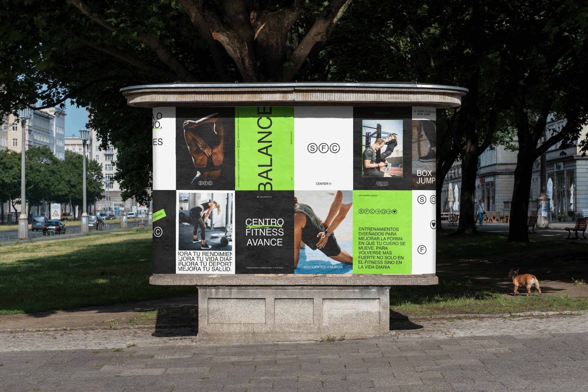
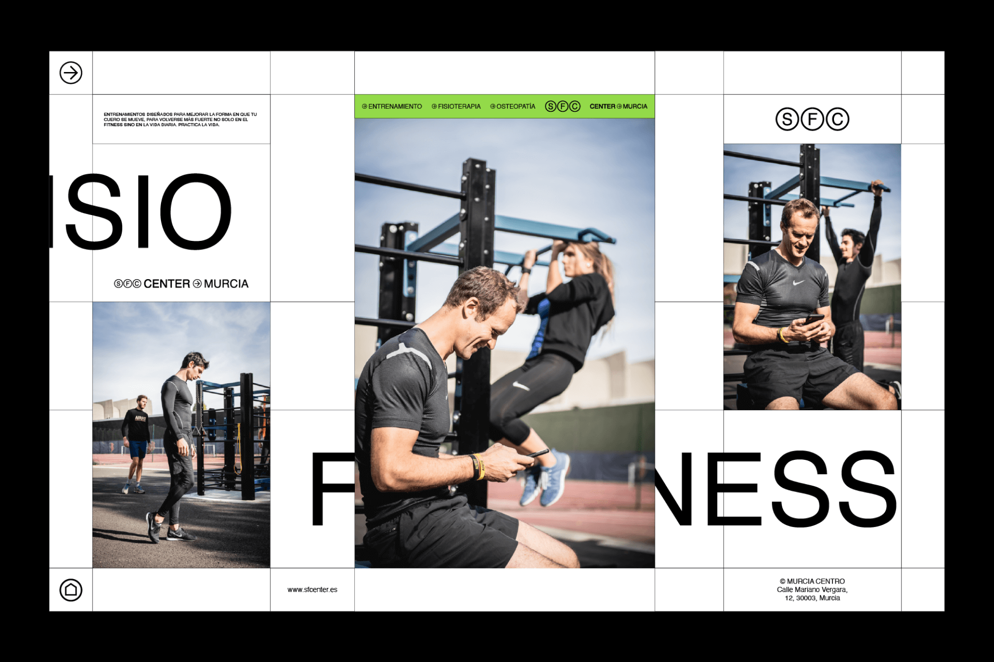
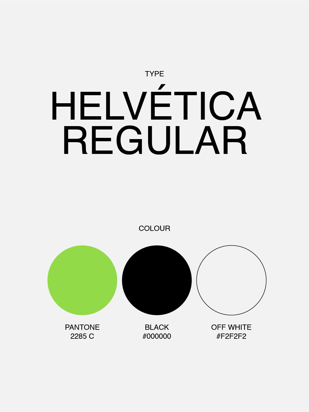
The exposed grid speaks to the brand’s transparency. The color palette relies on a single intense green, chosen for its distinctive quality within the current fitness landscape. The typography is neutral, intended to provide stability to the new holistic concept of the center while evoking a sense of openness and comfort.
