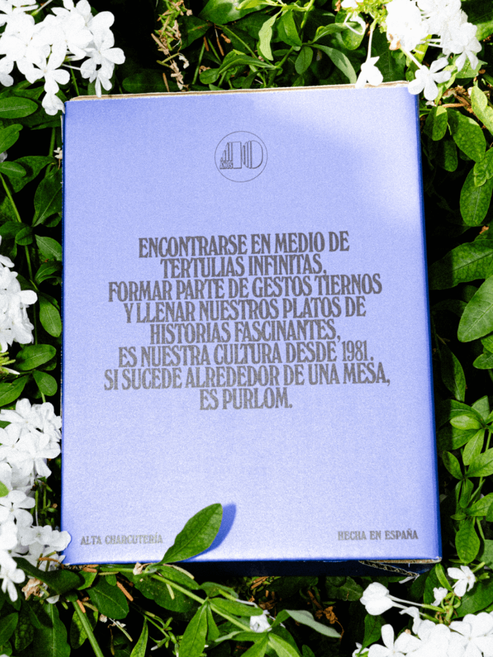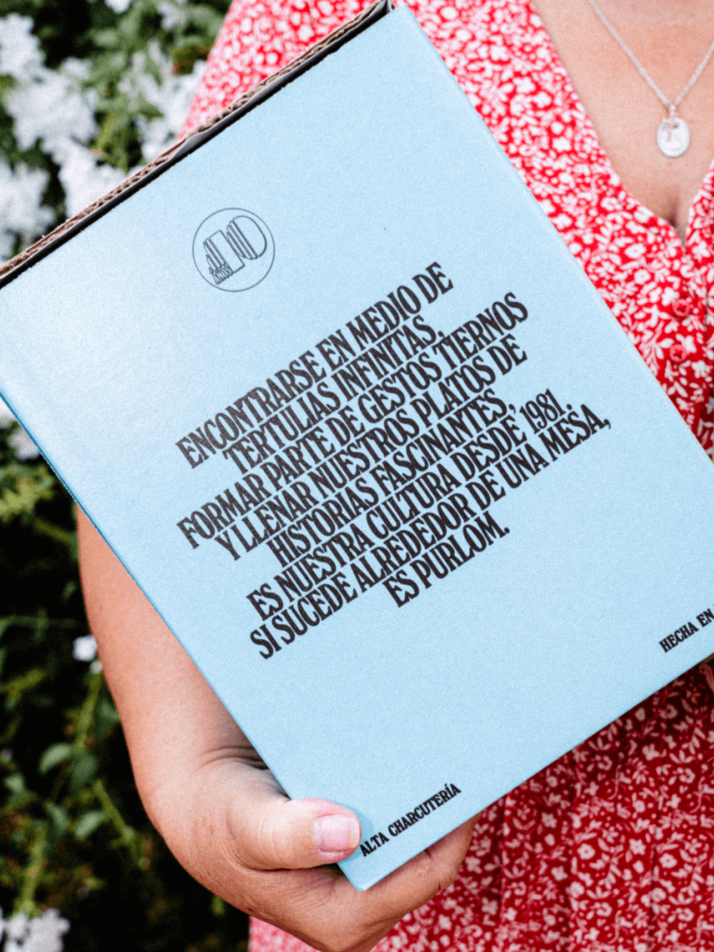
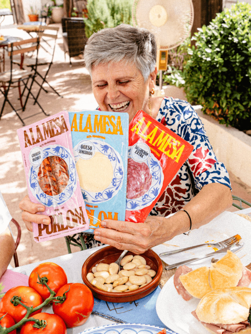
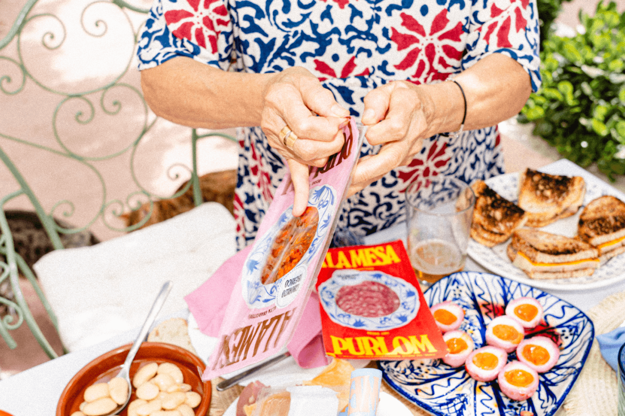
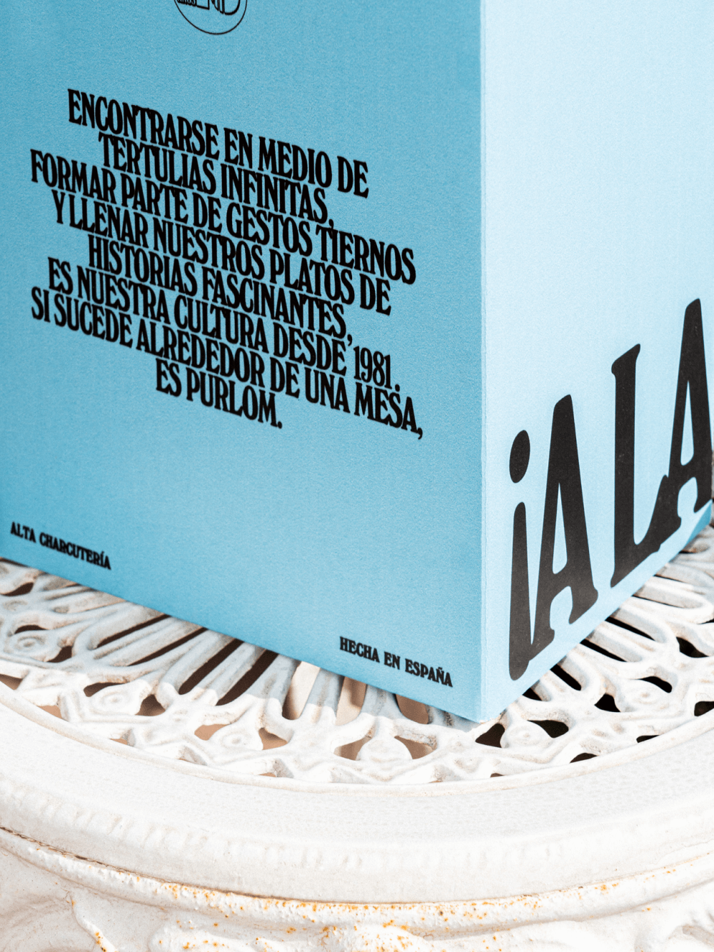
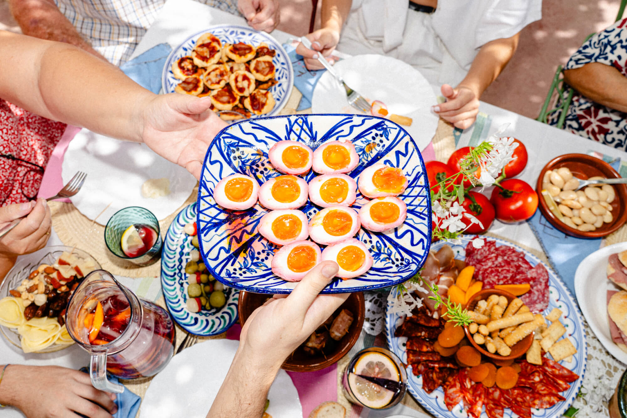
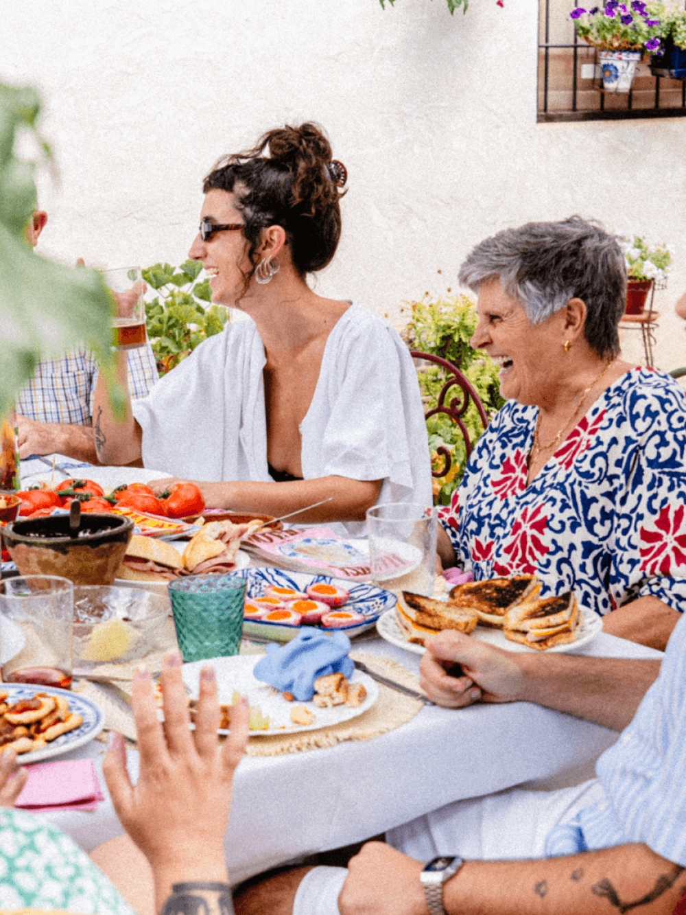
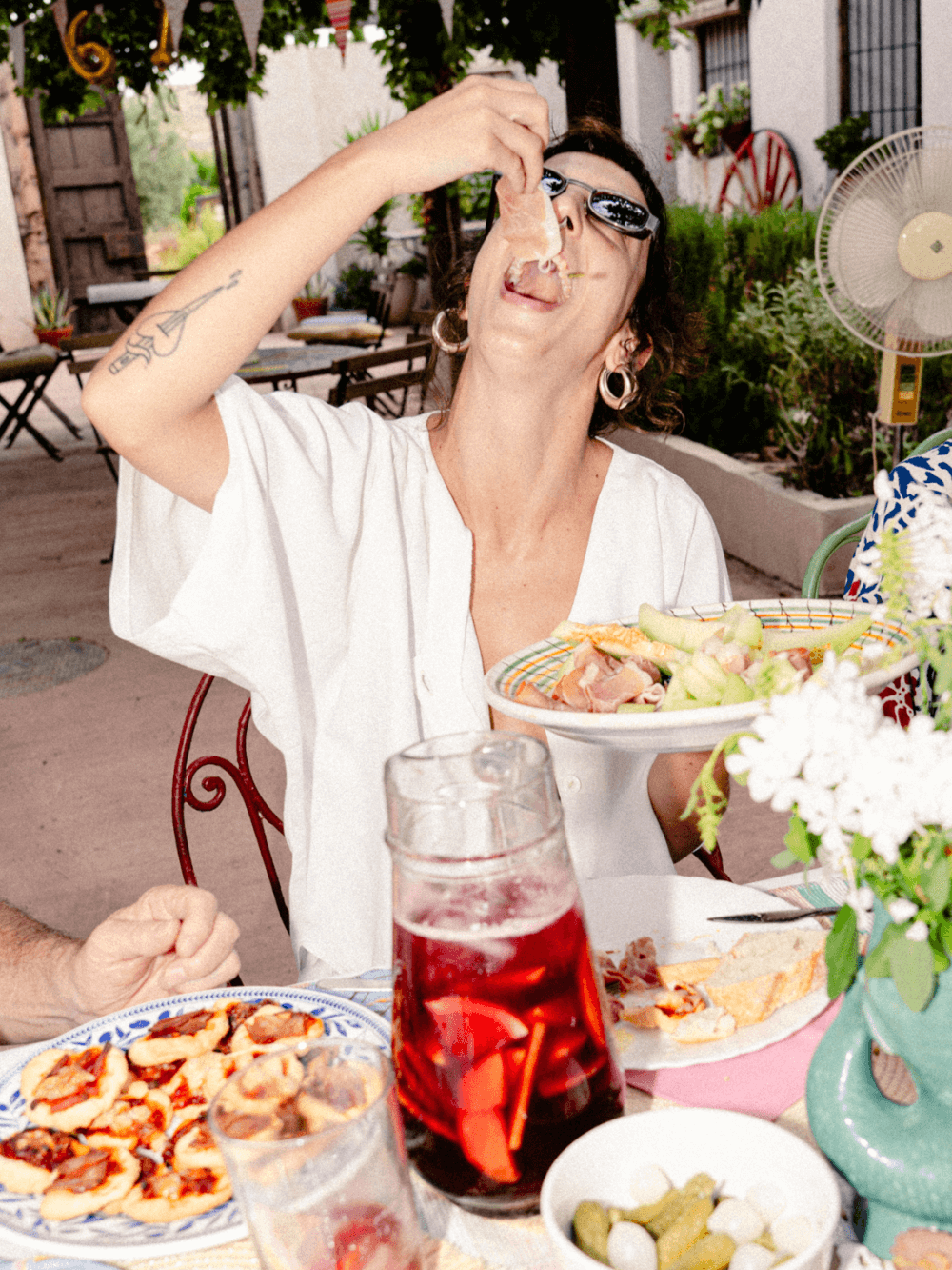
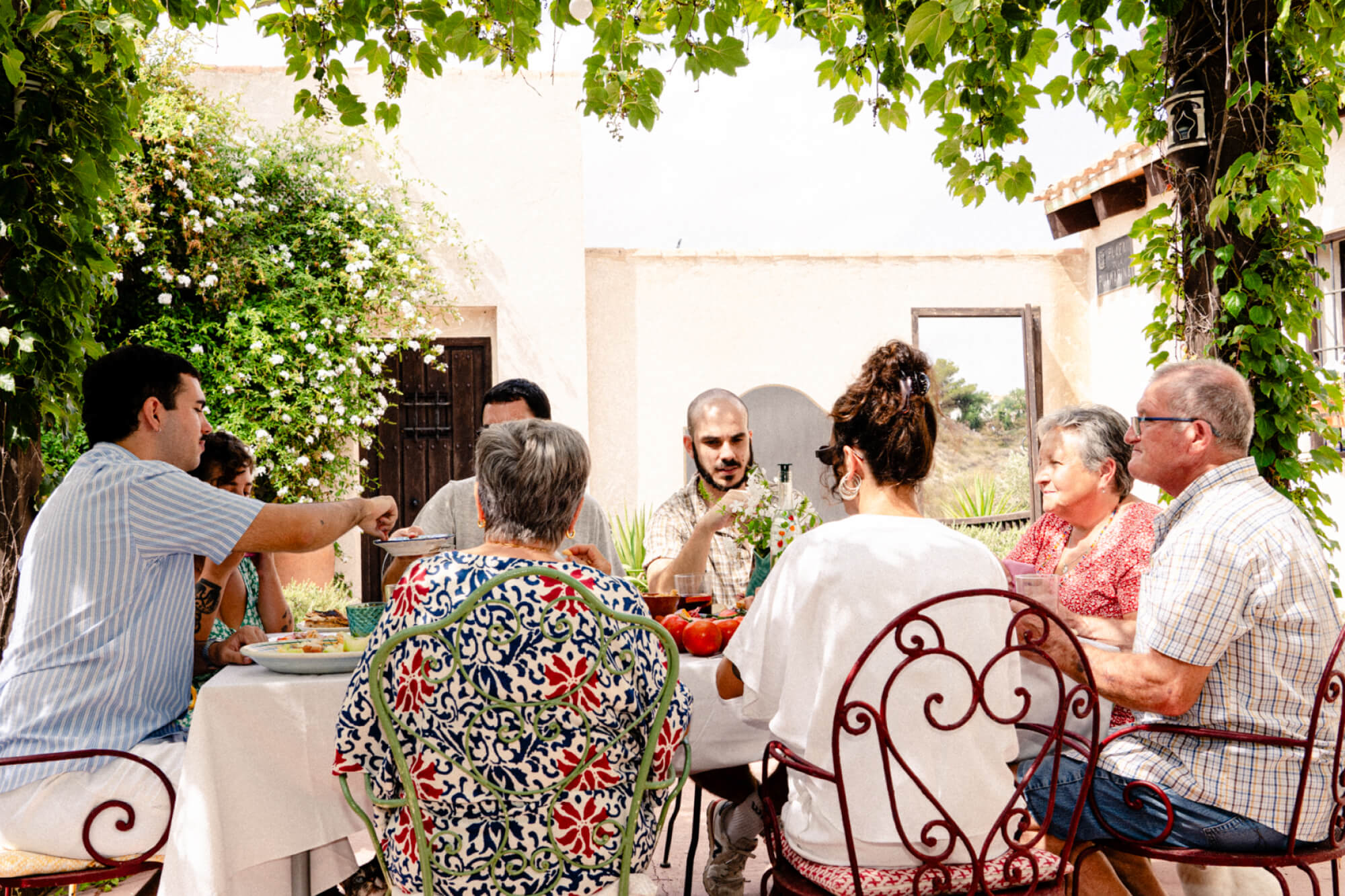
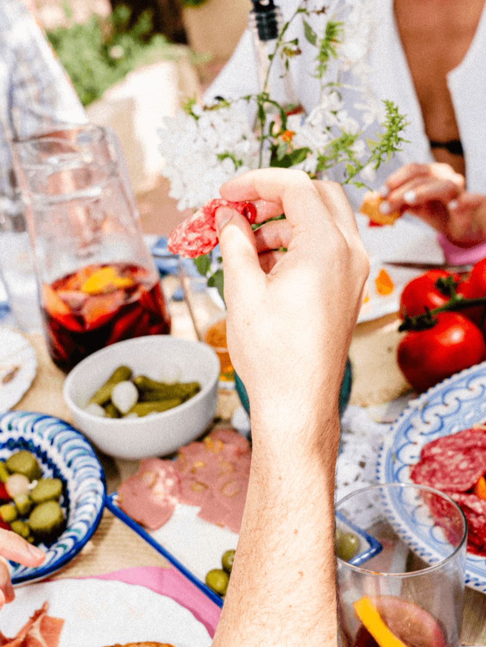
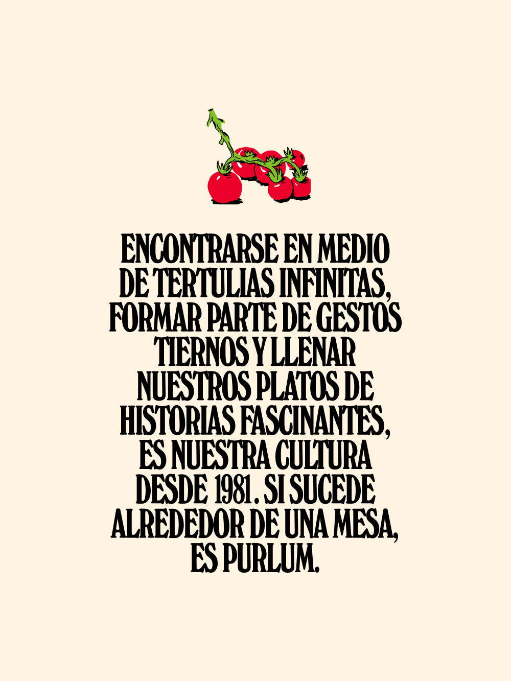
Meeting in the middle of endless get-togethers, being part of tender gestures and filling our plates with fascinating stories – that has been our culture since 1981. If it happens around a table, that’s PURLOM.
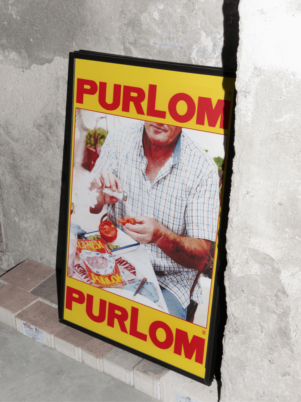
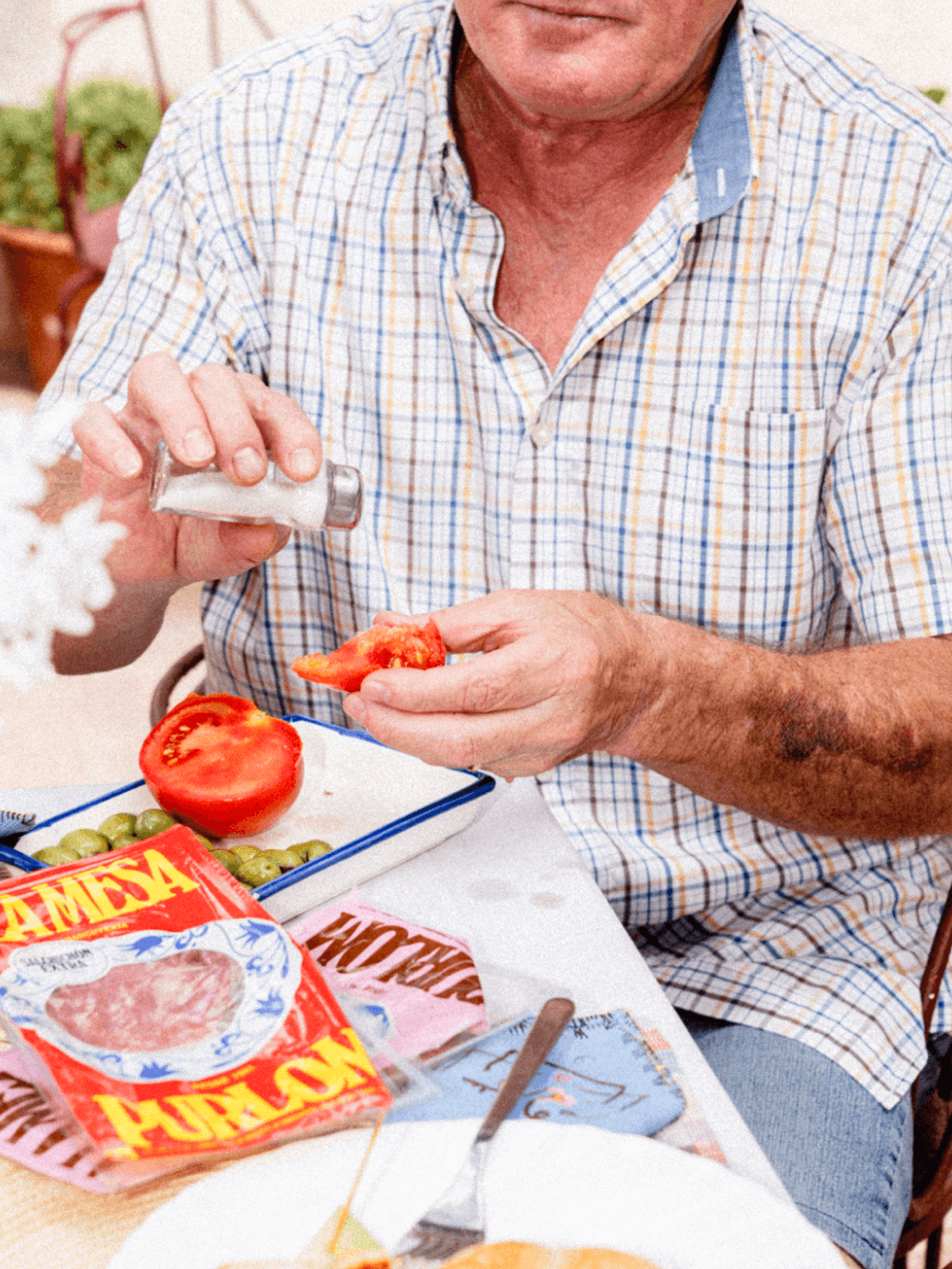
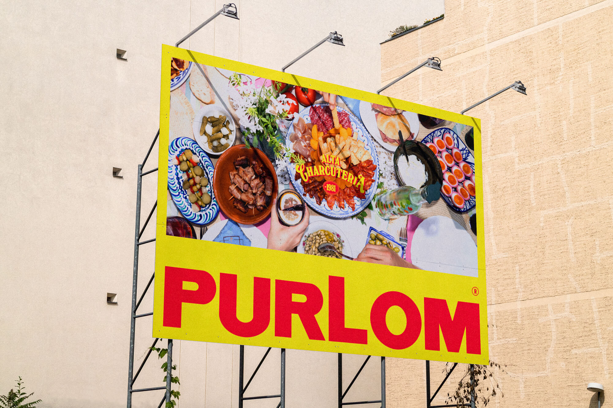
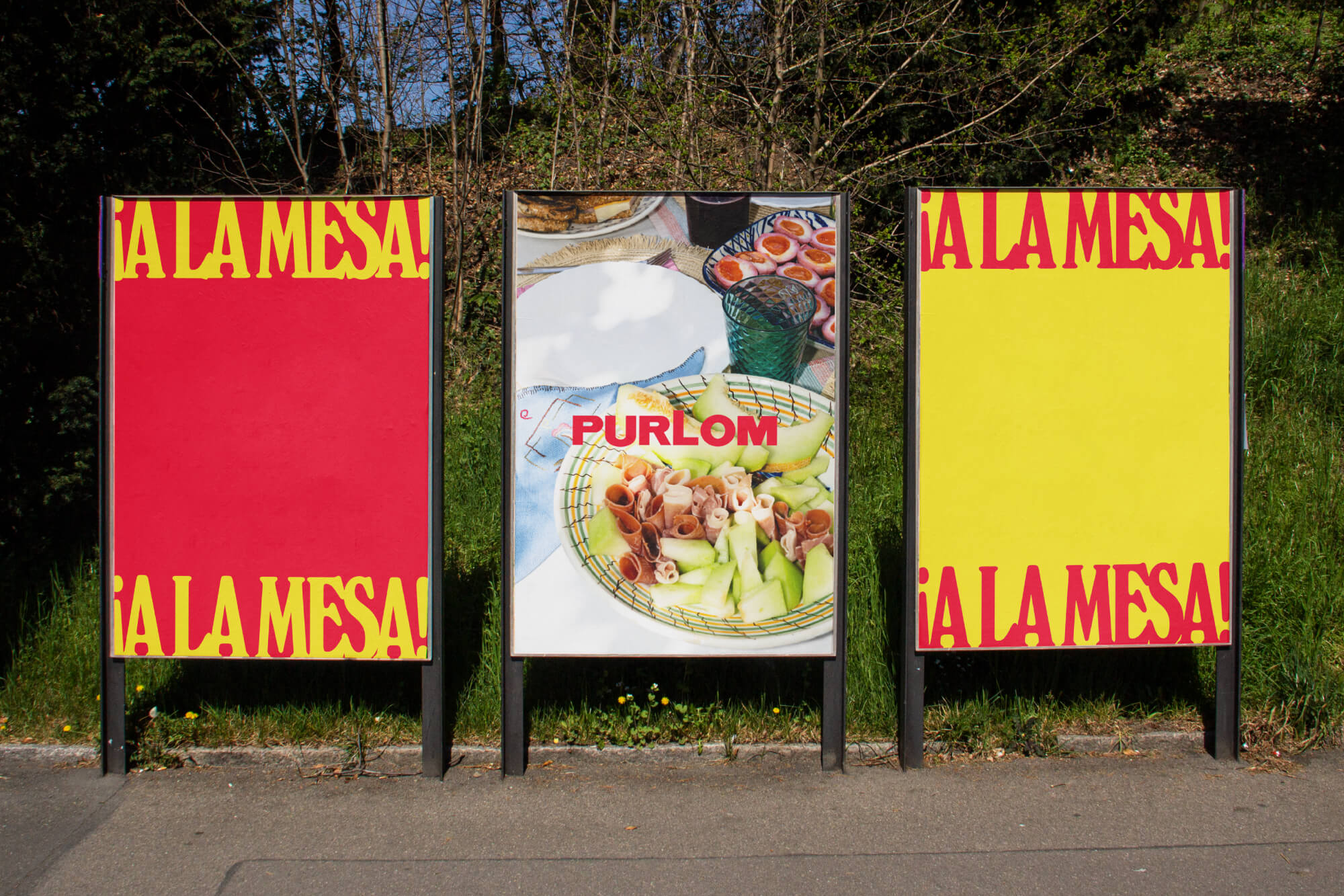
Our design process starts with research, brand strategy and positioning. With Purlom we also needed to come up with a concept that gave us ample scope to play with the brand. Once we landed on the A LA MESA concept, the brand story and aesthetic flowed naturally.
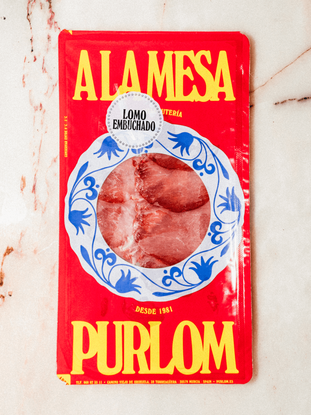
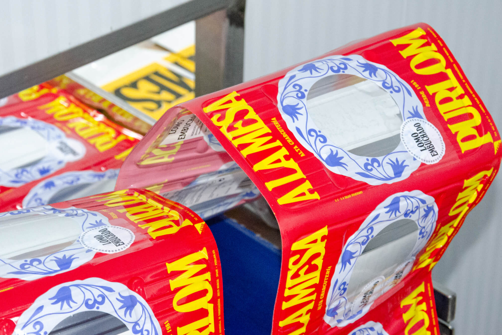
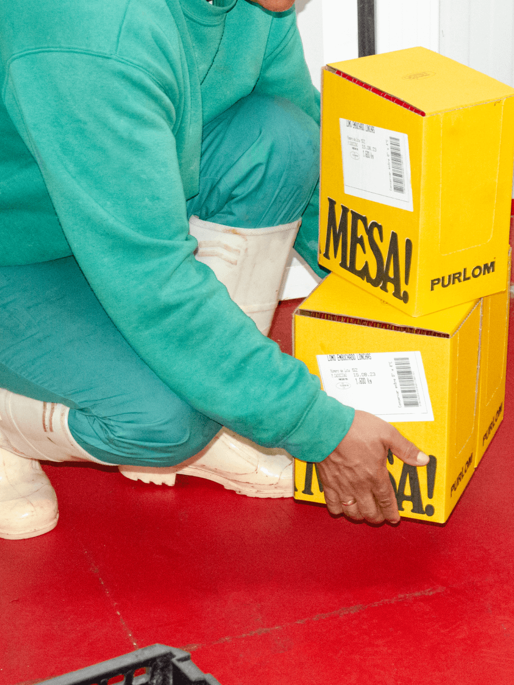
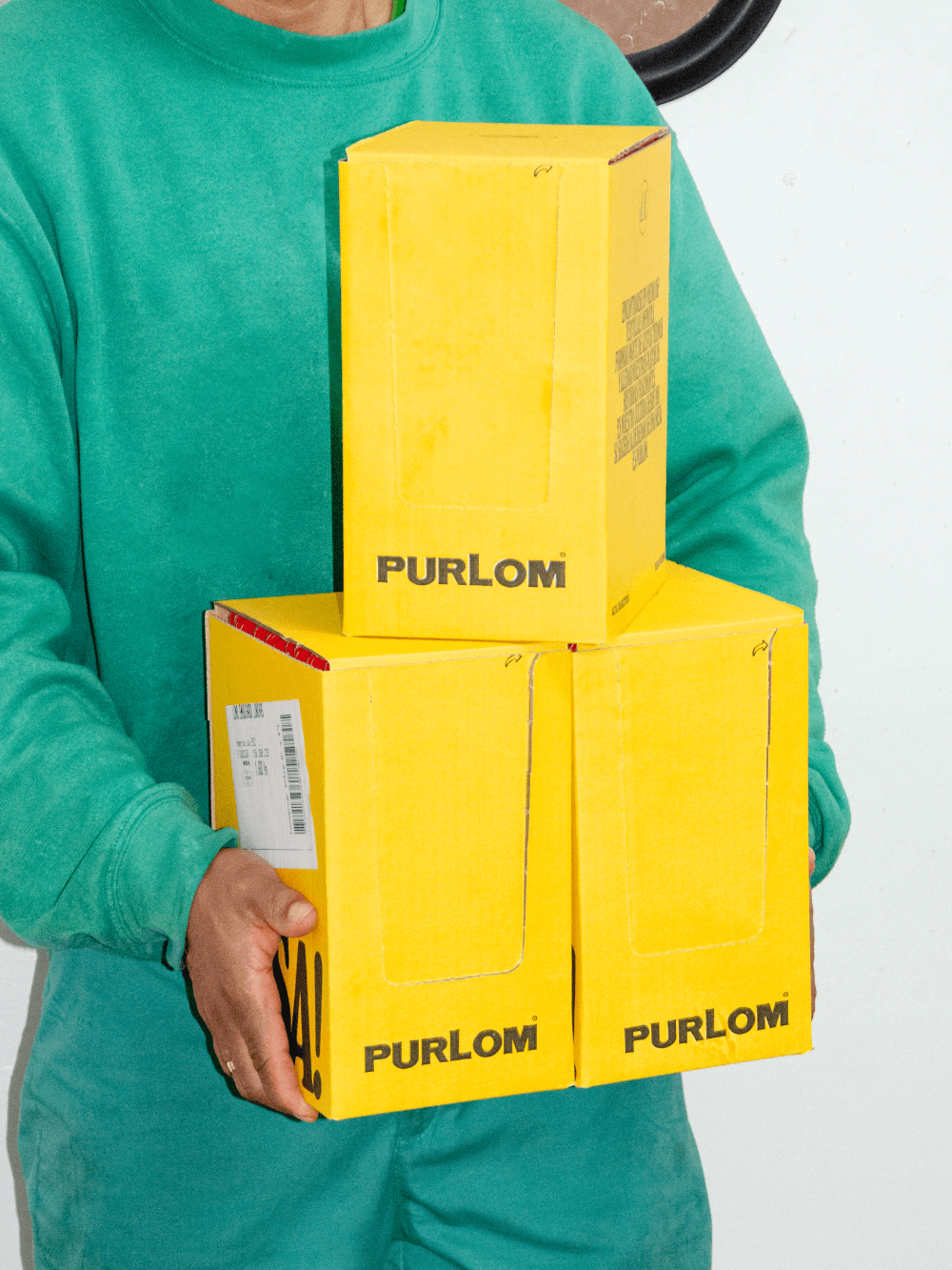
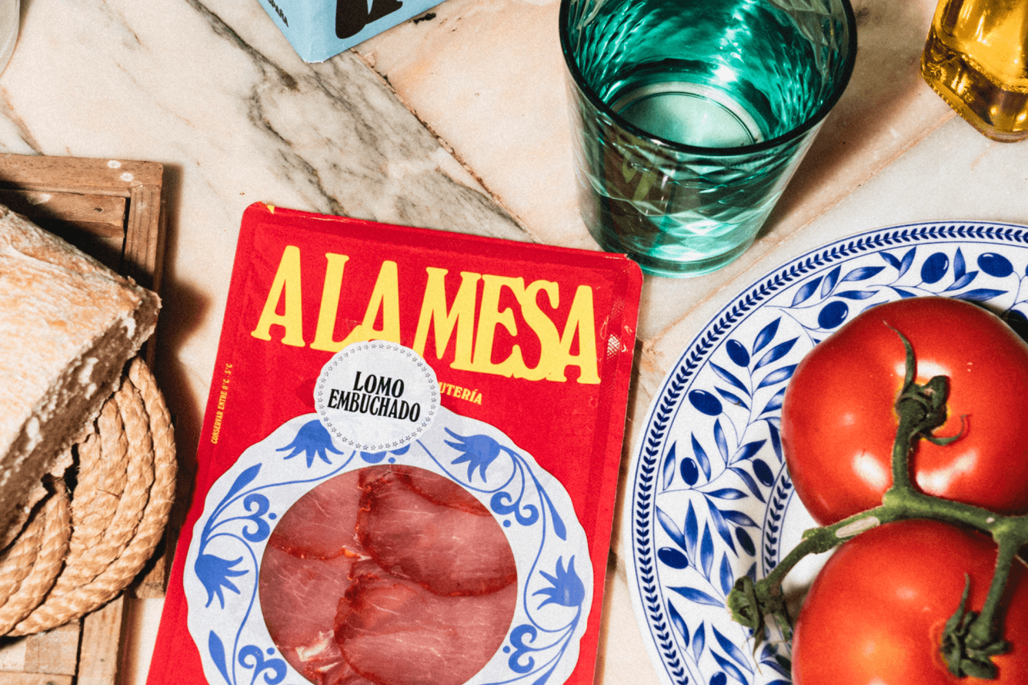
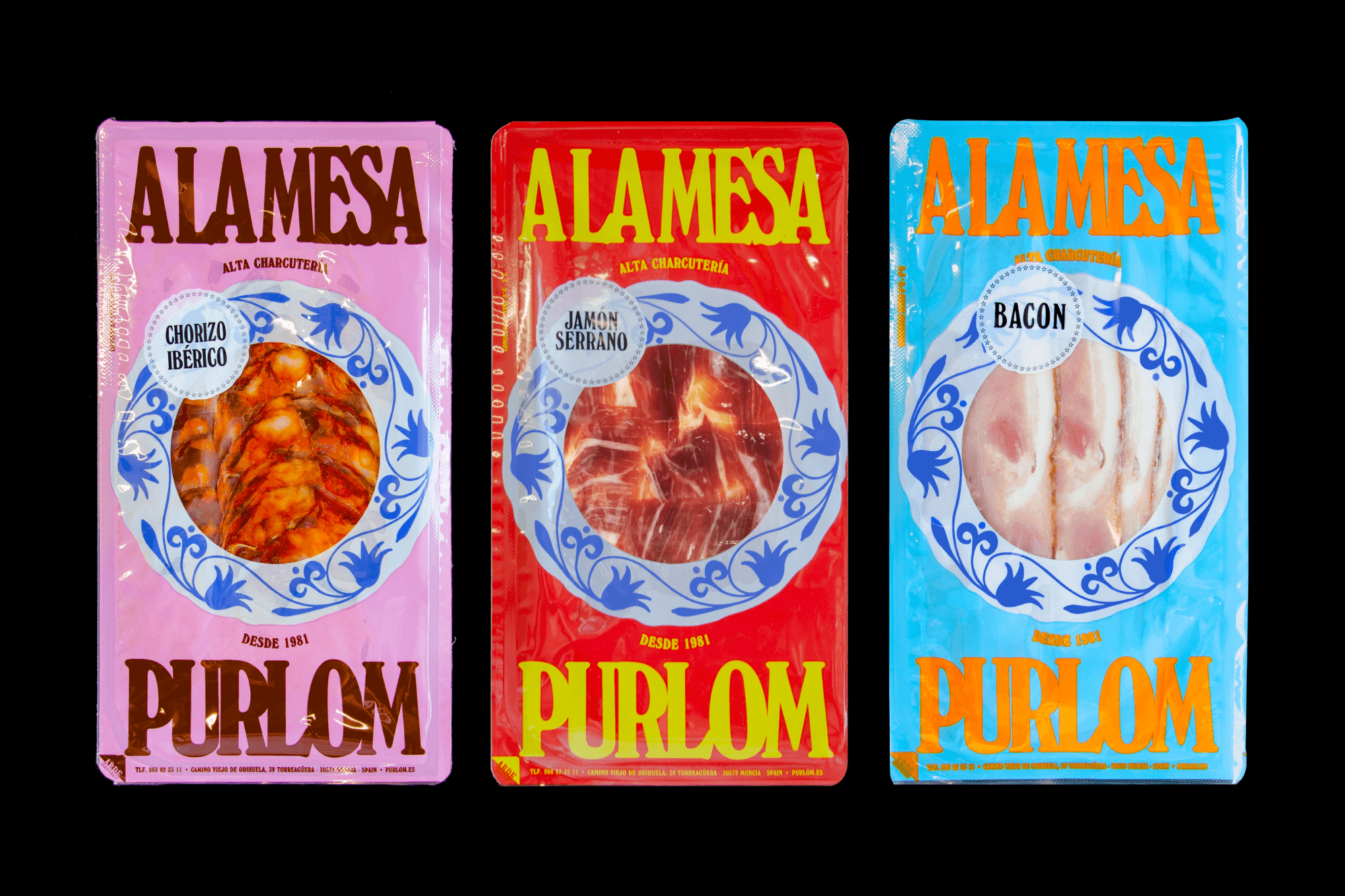
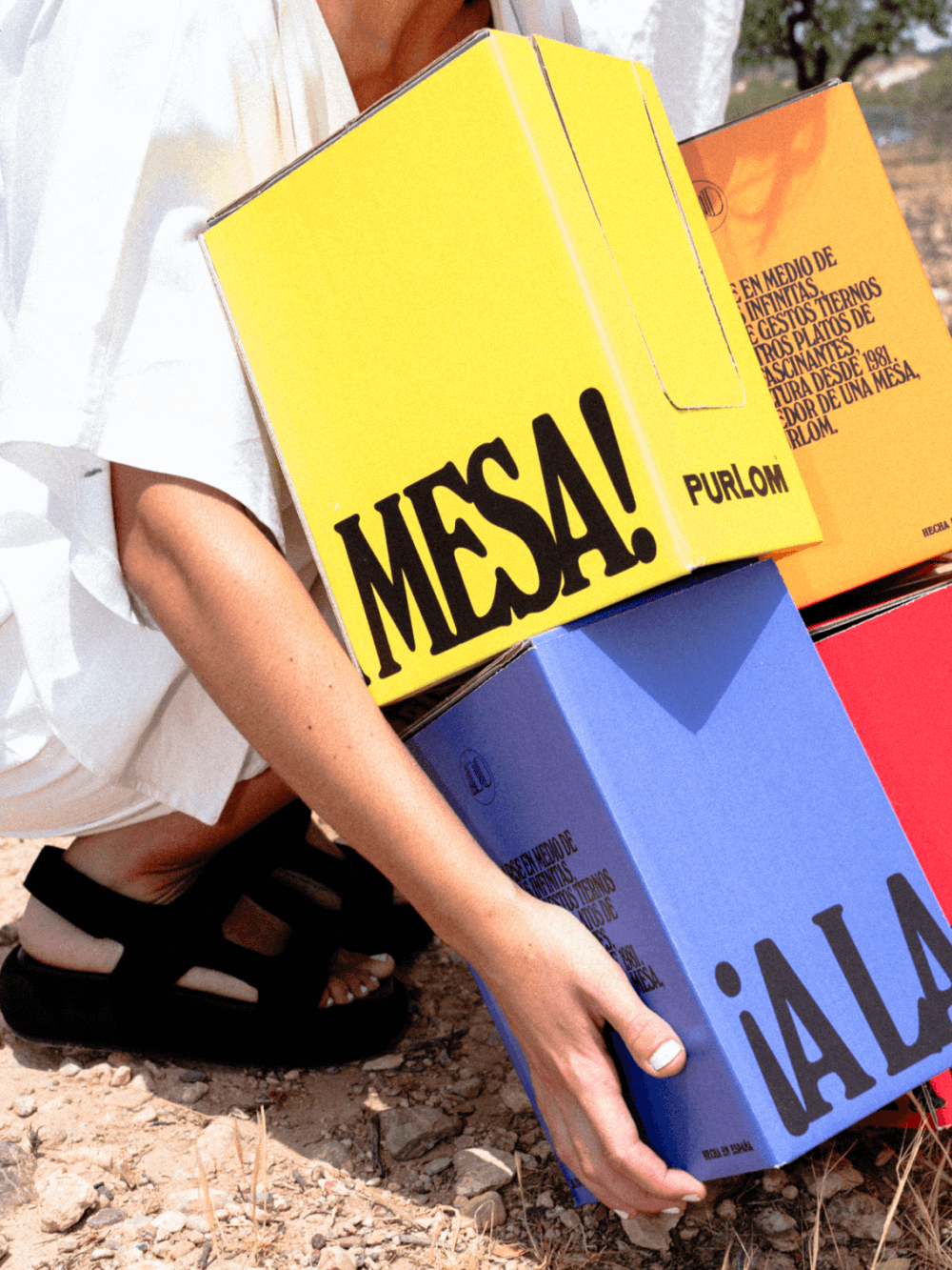
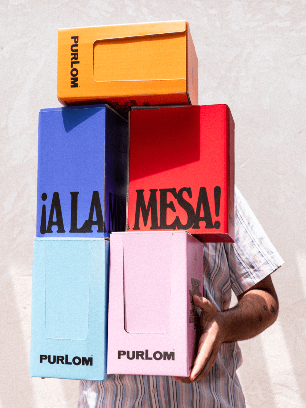
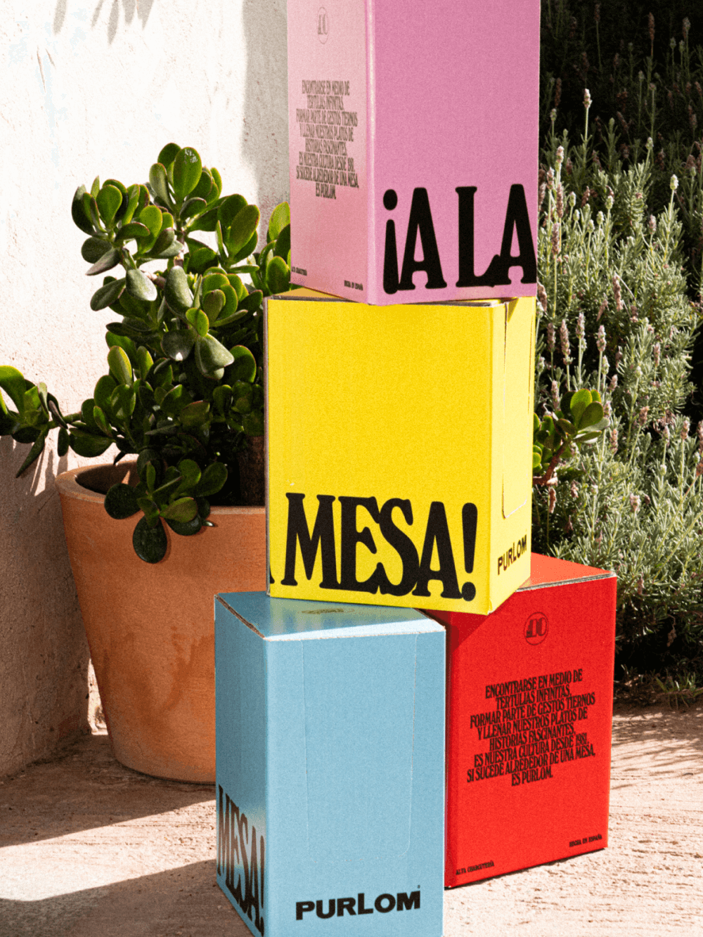
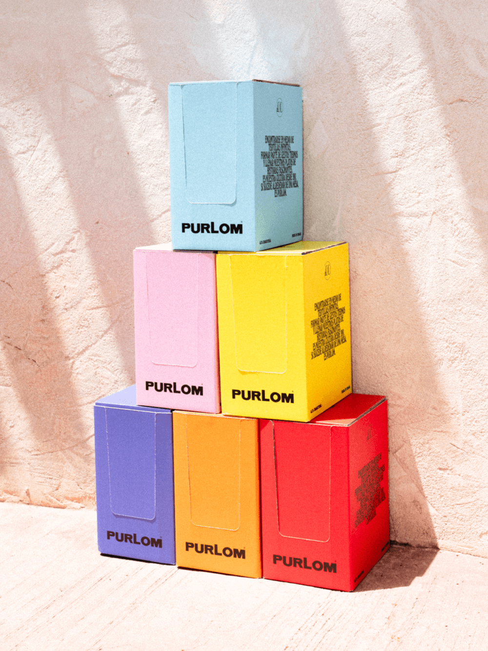
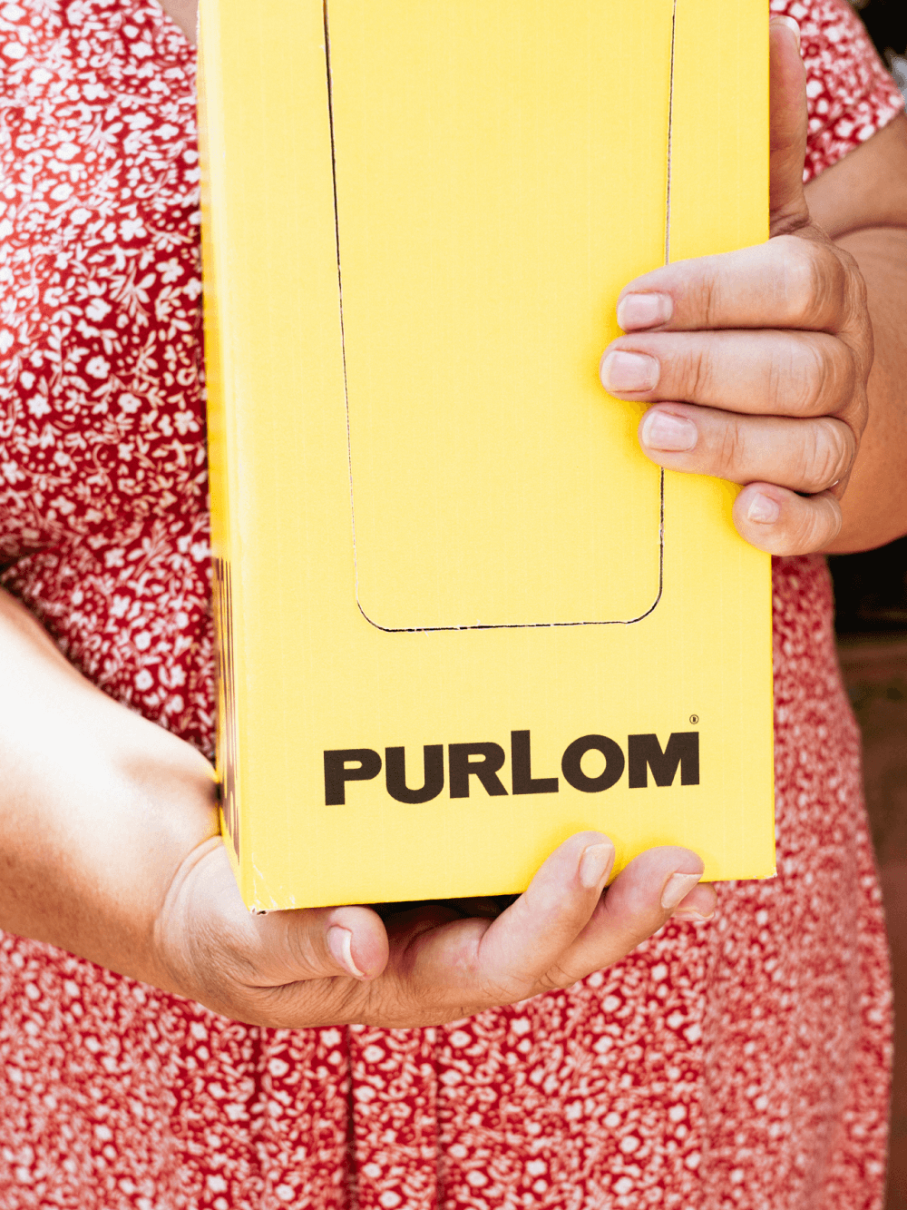
We were obsessed with creating packaging loaded with nostalgia and full of personality, capable of catching the eye on the shelf of any deli aisle. We proposed a unique box design that fits all products regardless of colour. This brings liveliness and dynamism to the brand. It elevates the project and reinforces the strong personality of PURLOM once again.
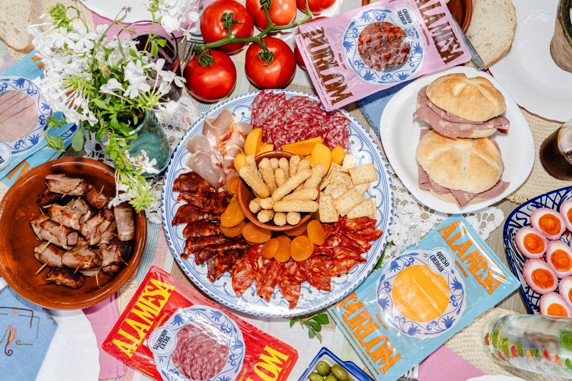
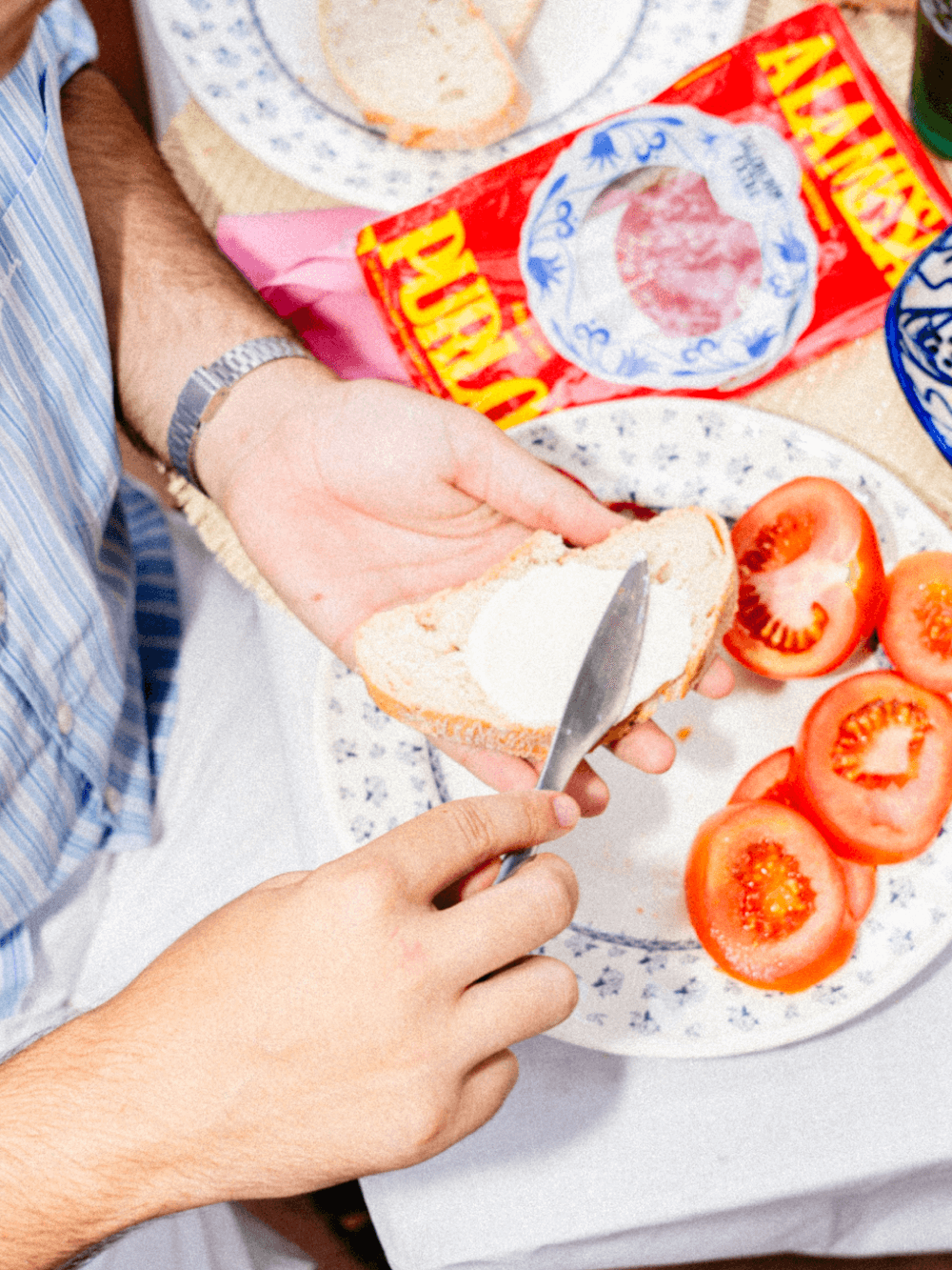
Indeed, among all the most wonderful and meaningful things that people remember, most of them took place around people’s dinner tables.
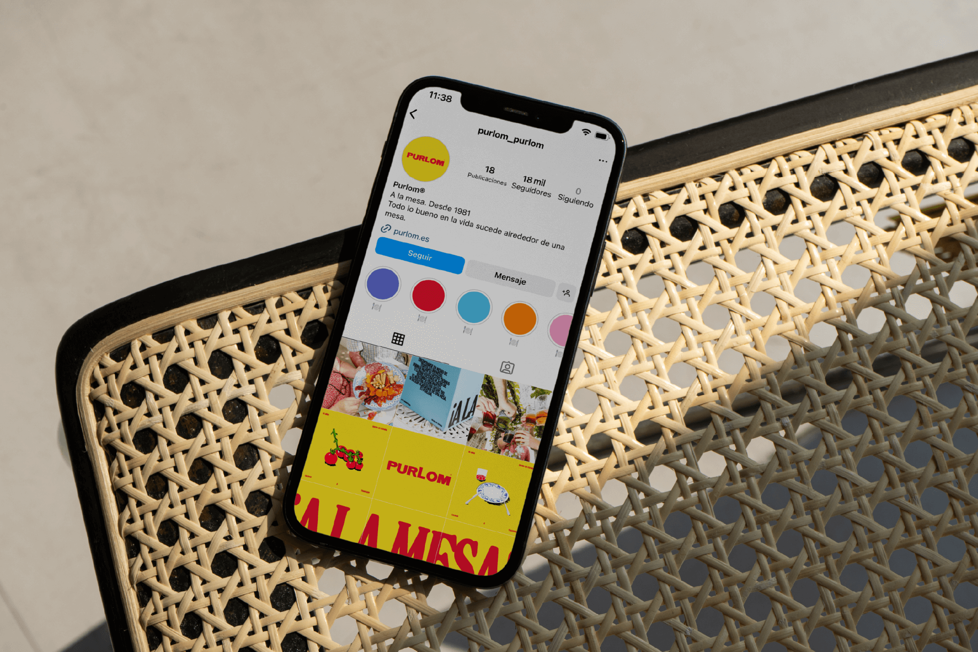
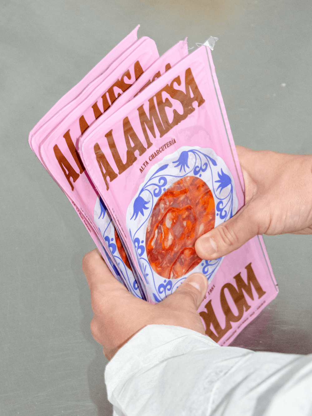
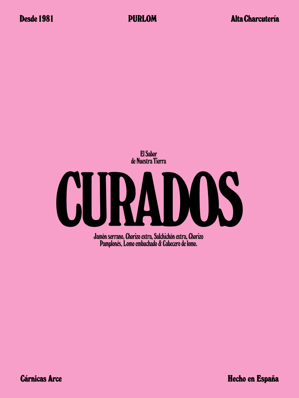
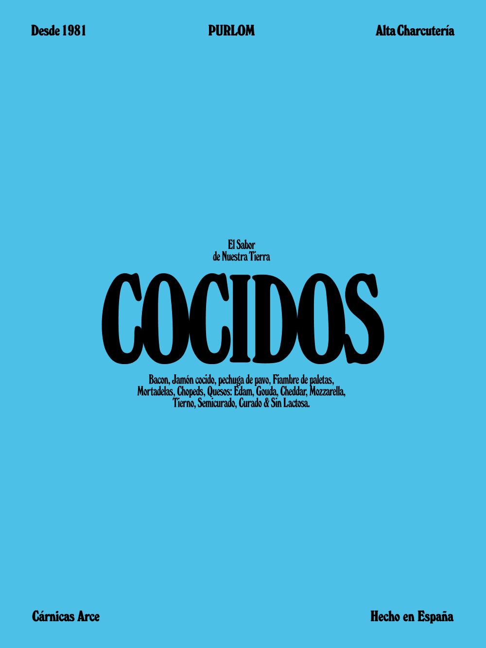
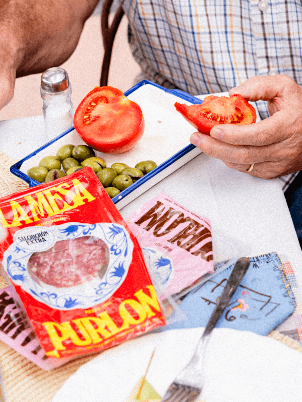
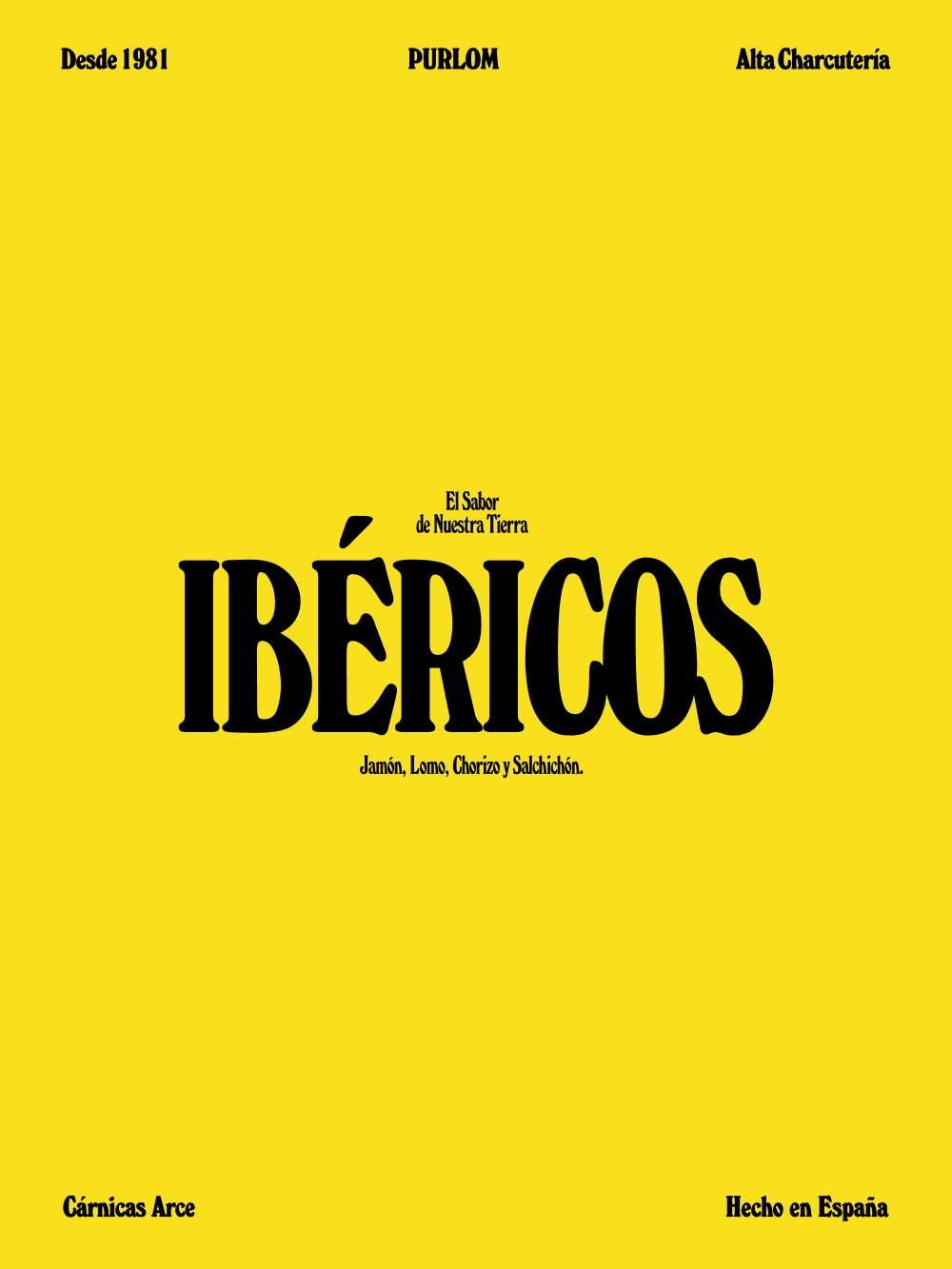
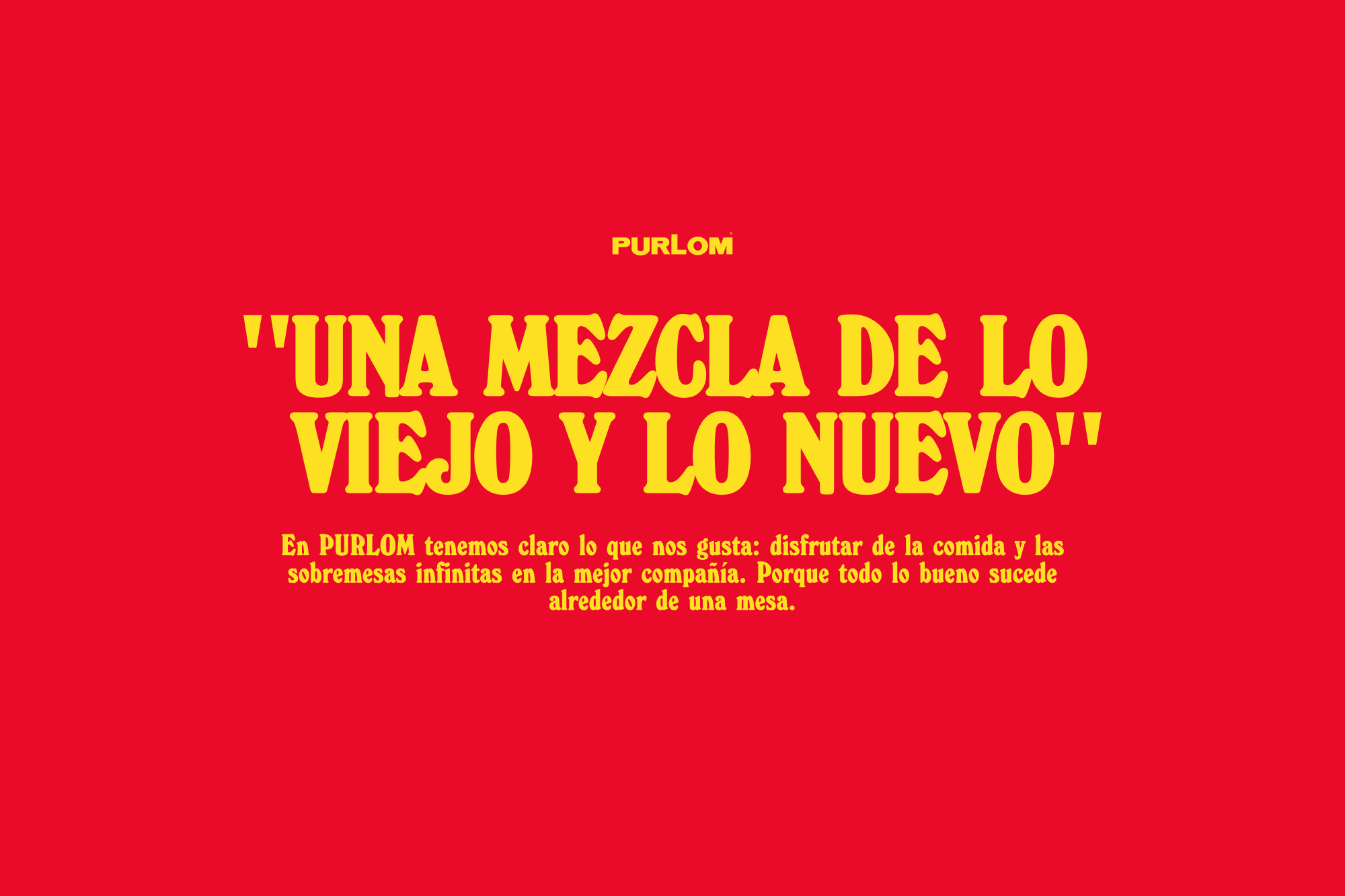
It’s a project that could have resulted in a dry, commercial production, but the combination of bold typography, the use of a vibrant colour palette and the use of illustrations within its graphic system make the result of PURLOM a brand that stands out for its innovative character within a traditionally classic sector while maintaining its projection as a small, familiar brand.”A mix of old and new”.
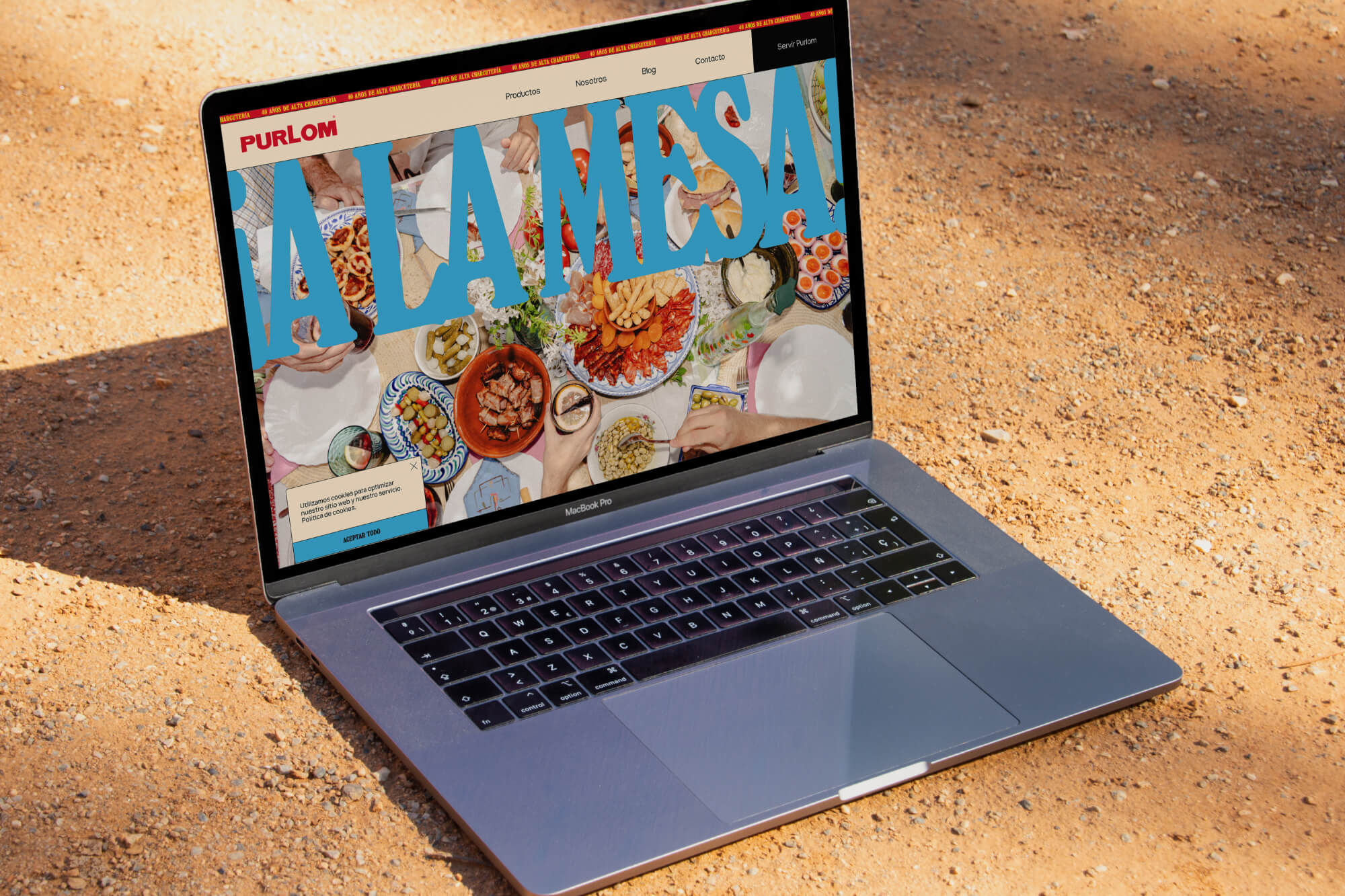
We undertook to develop a brand identity system that balanced two objectives: to appeal to a modern and progressive audience, while reflecting the traditional processes of Purlom, which has been in the industry for 40 years.
