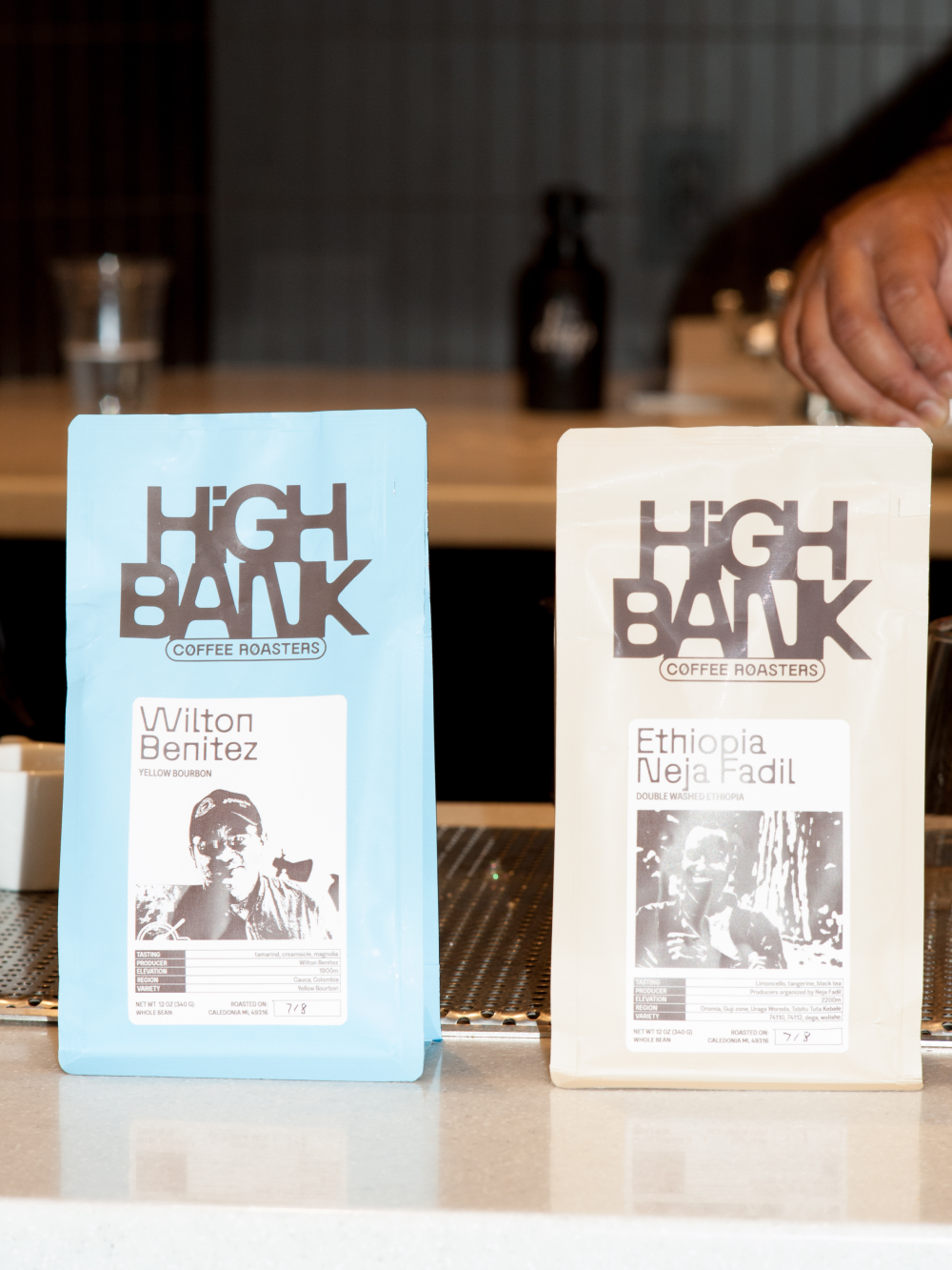
High Bank Coffee Roasters is based in Michigan and is much more than a subscription coffee roaster; it is a gateway to a sensory and cultural journey that connects coffee lovers with the origins of every bean. In our studio, we created a visual identity that not only celebrates the diversity of the products’ origins but also tells the story behind each cup.
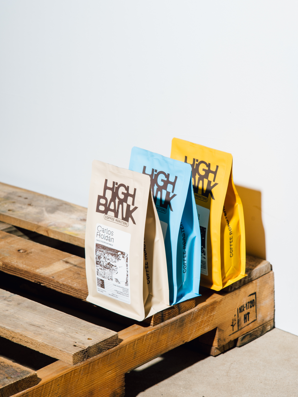
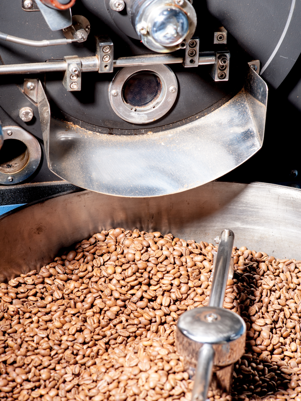
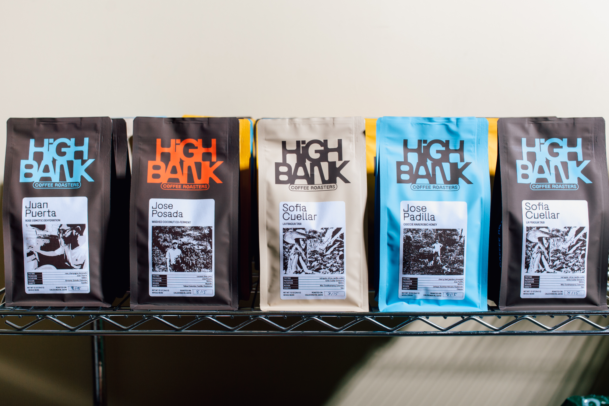
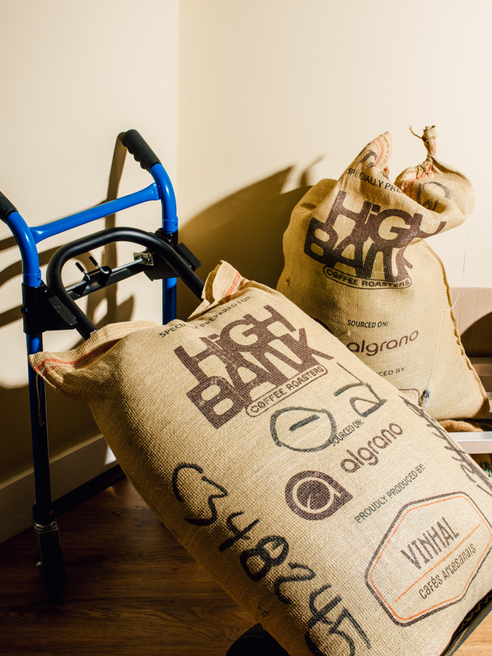
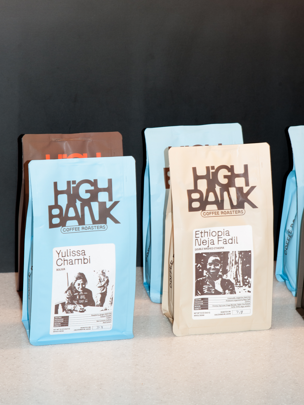
The essence of High Bank Coffee Roasters lies in its documentary approach: each package is a window that transports us to different corners of the world, from the lush green mountains of Colombia to the volcanic landscapes of Ethiopia. It’s not just the first sip that defines the experience but the entire morning ritual—from the moment you wake up to when the aroma of freshly brewed coffee fills your senses and prepares you for the day.
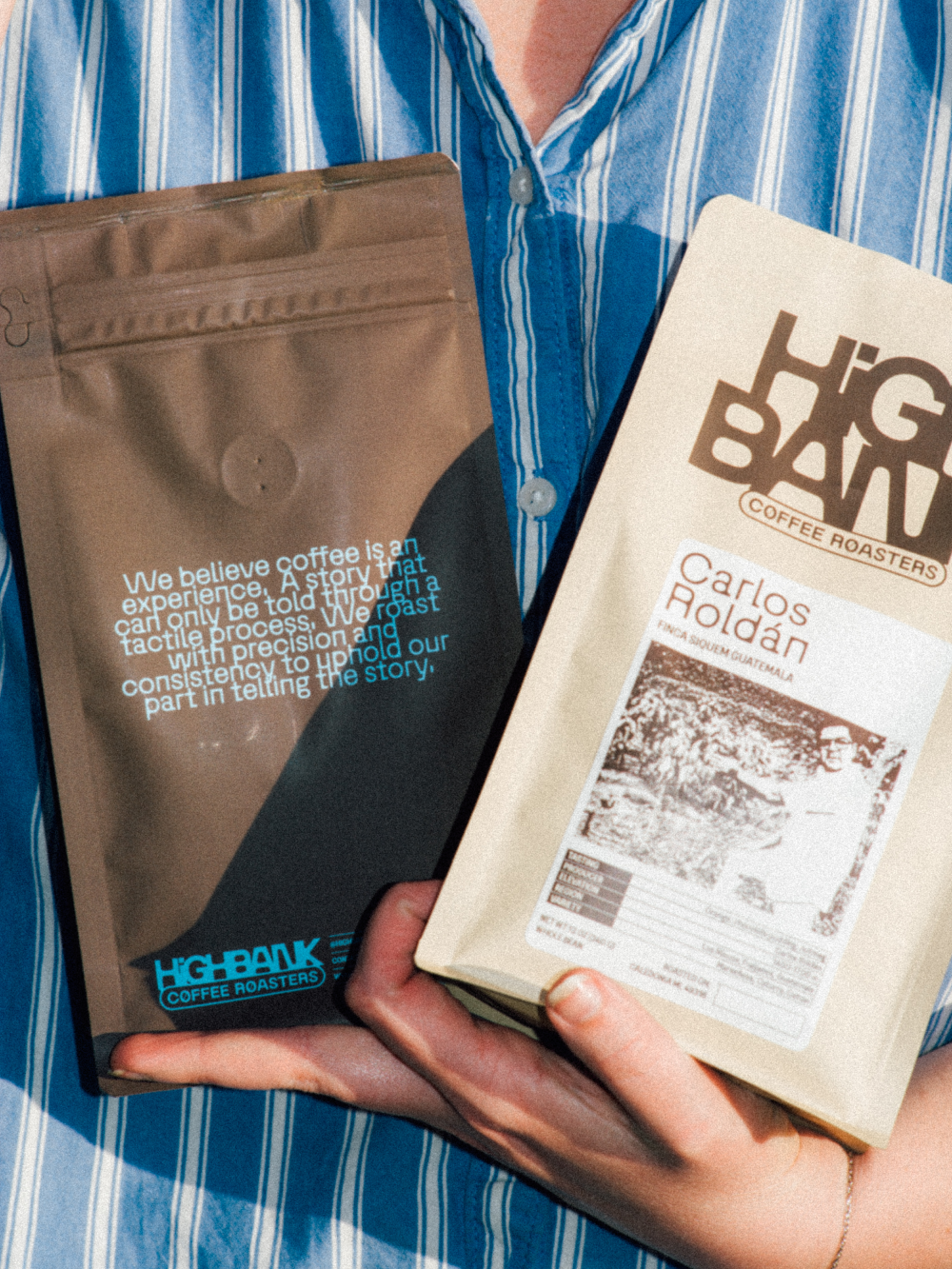
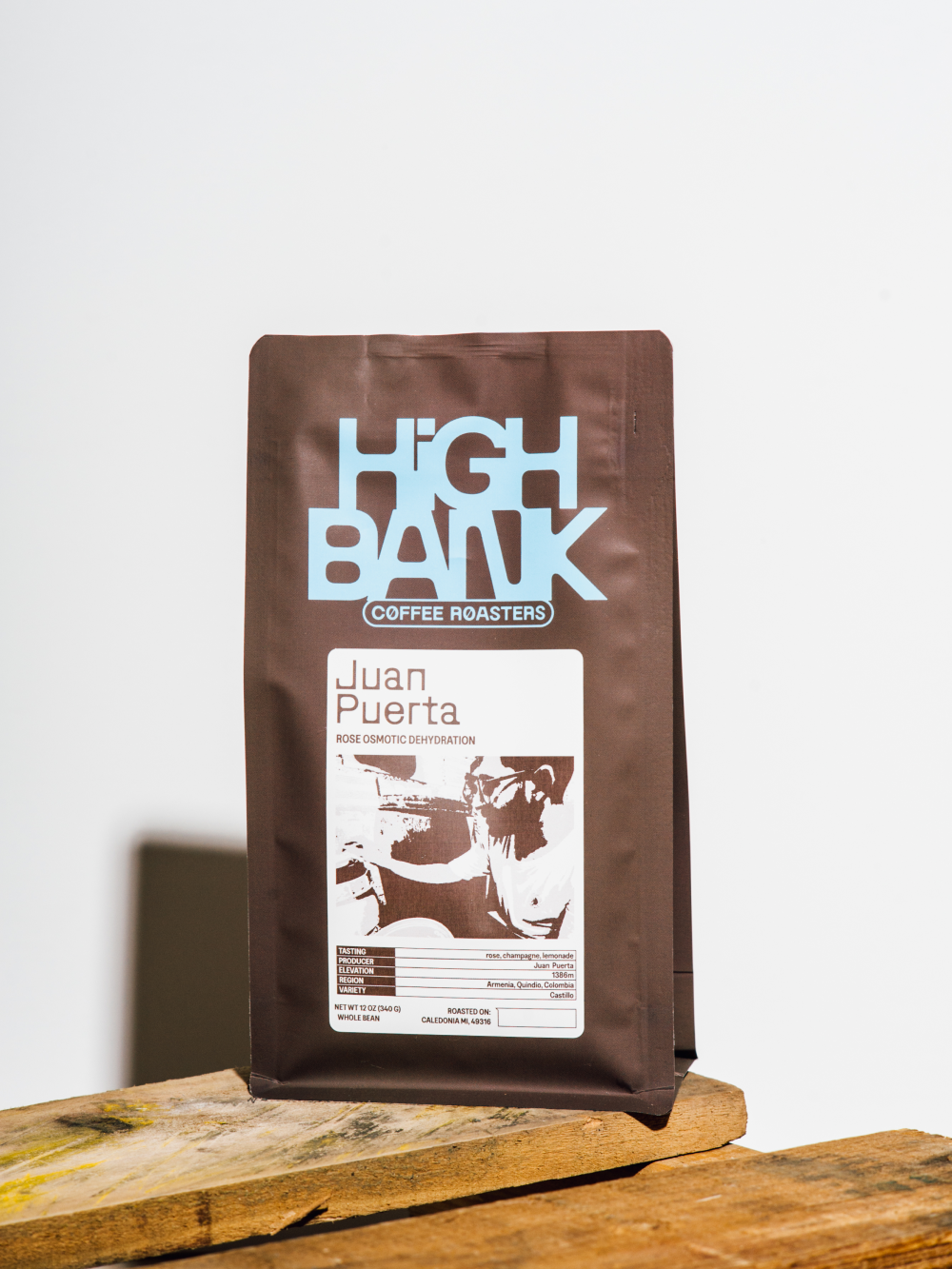
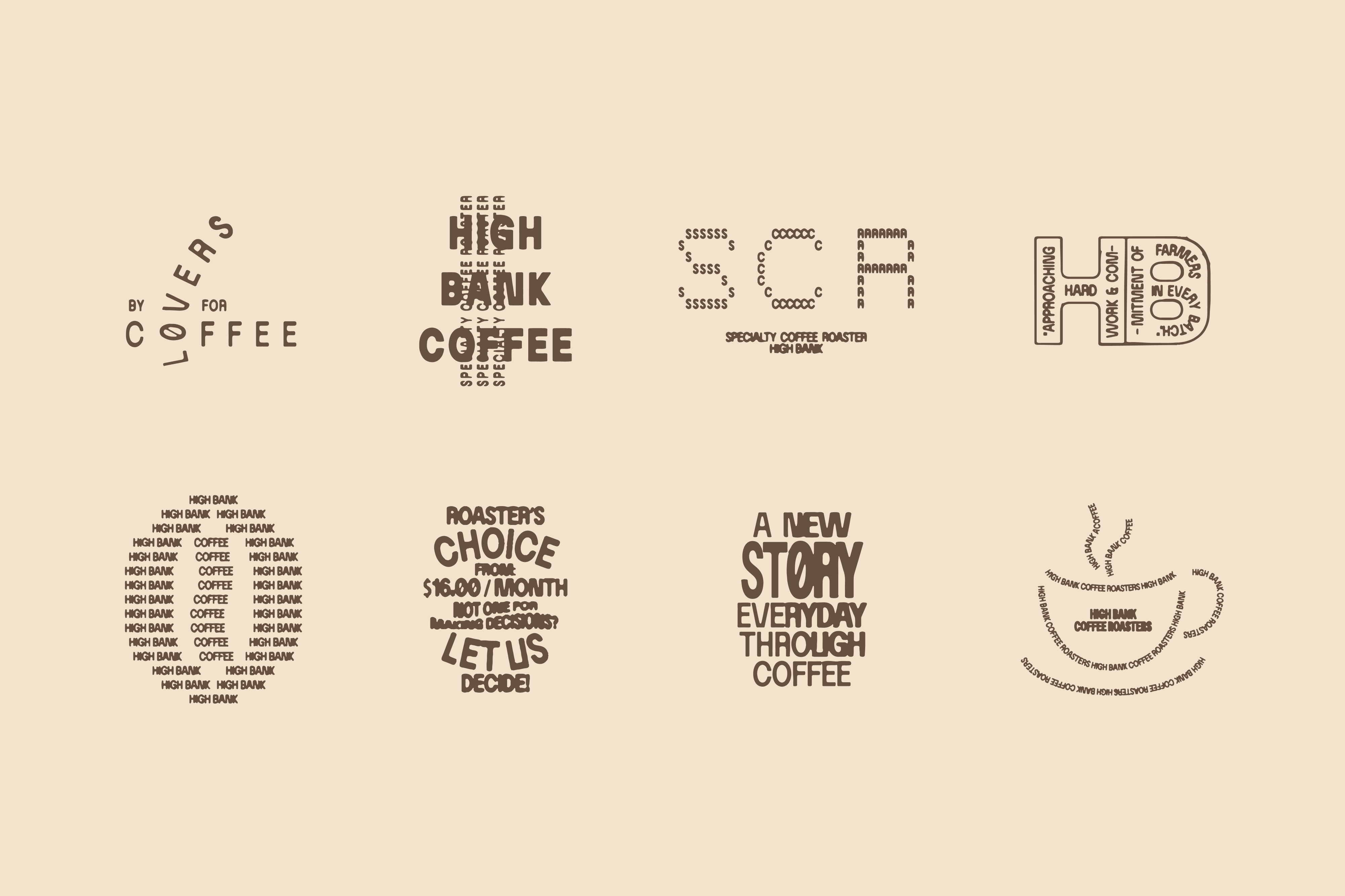
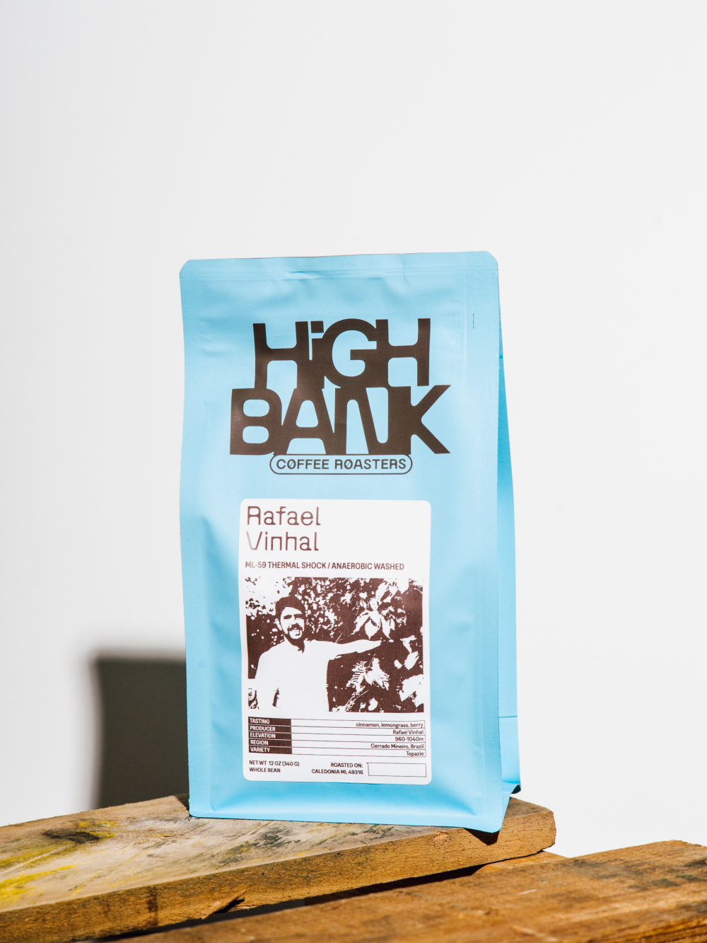
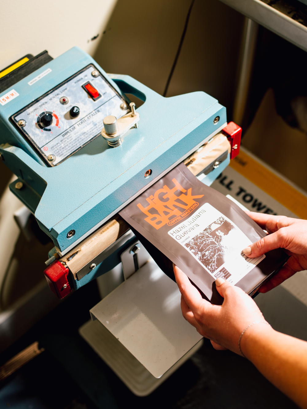
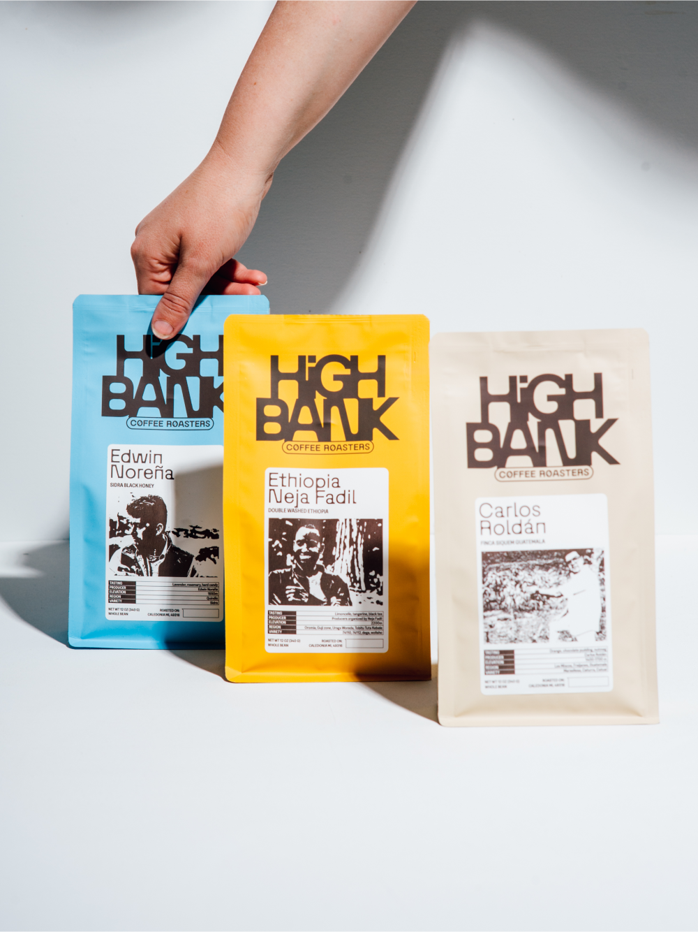
To capture this richness, we selected an exclusive typography inspired by the stains left by a coffee cup on a tablecloth—a visual metaphor that encapsulates both the imperfection and beauty of everyday life. This typography serves as the visual thread of High Bank’s identity, reflecting its commitment to authenticity and diversity.

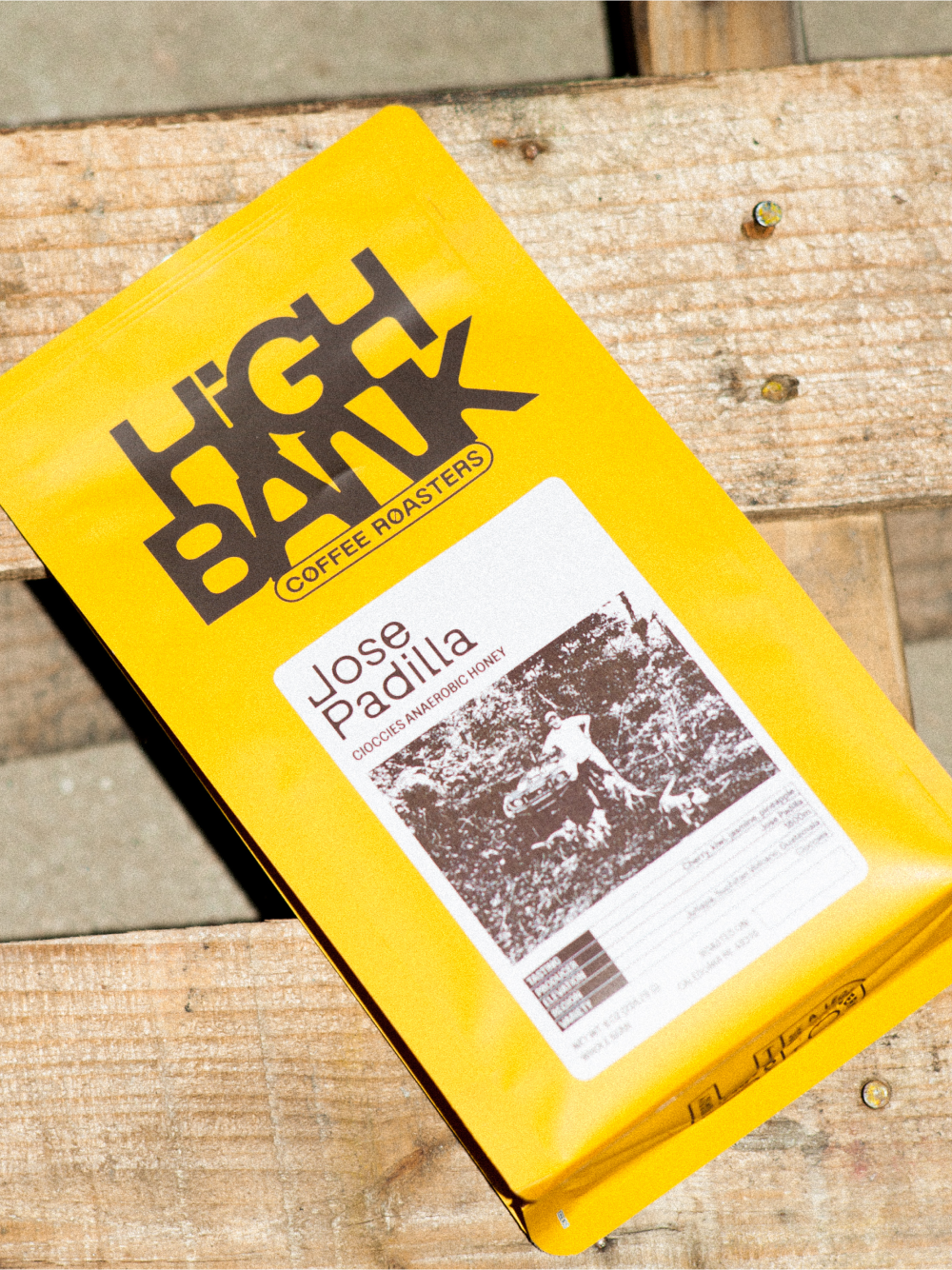
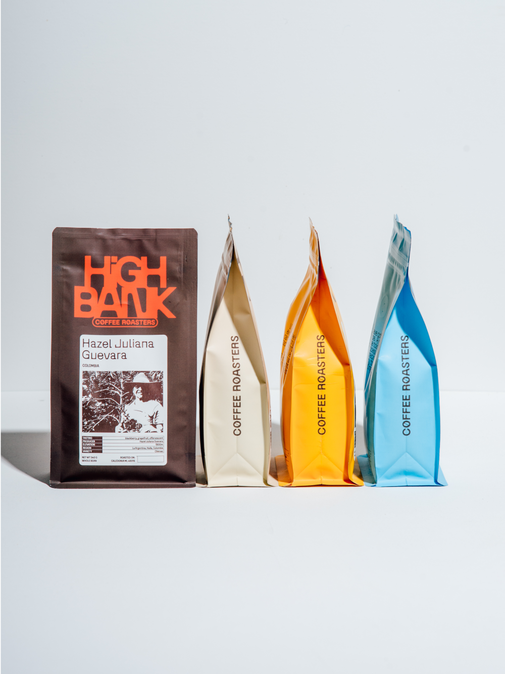
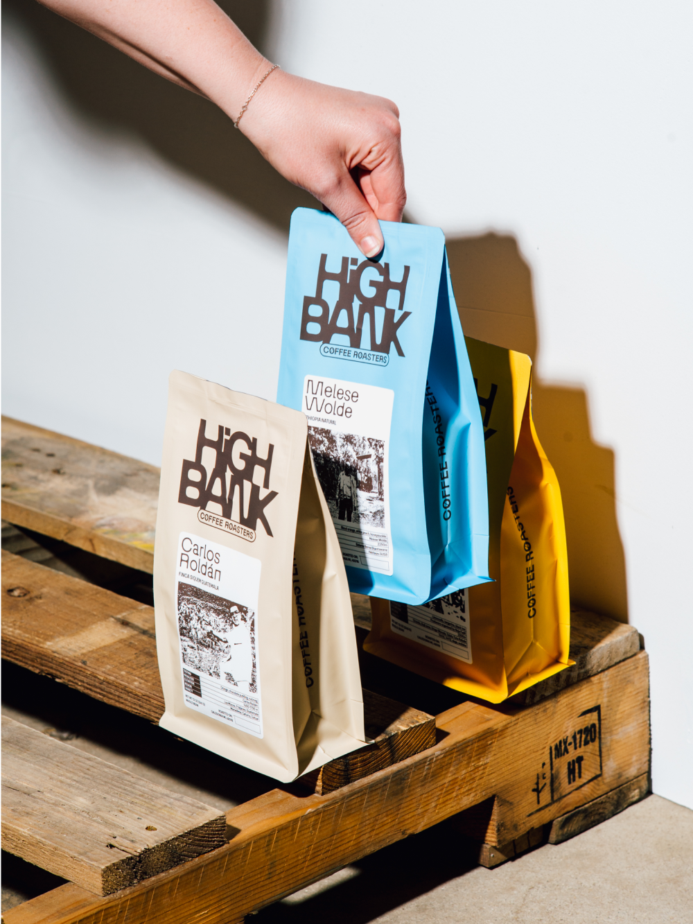
Each label from High Bank Coffee Roasters highlights the human touch behind every bean. The names on each package not only identify the region of origin but also pay tribute to the local producers whose skilled hands cultivate the coffee in some of the most remarkable places on Earth. We take pride in being the intermediary that connects these artisans with our customers, bringing them closer to distant destinations through an exceptional cup of coffee.
