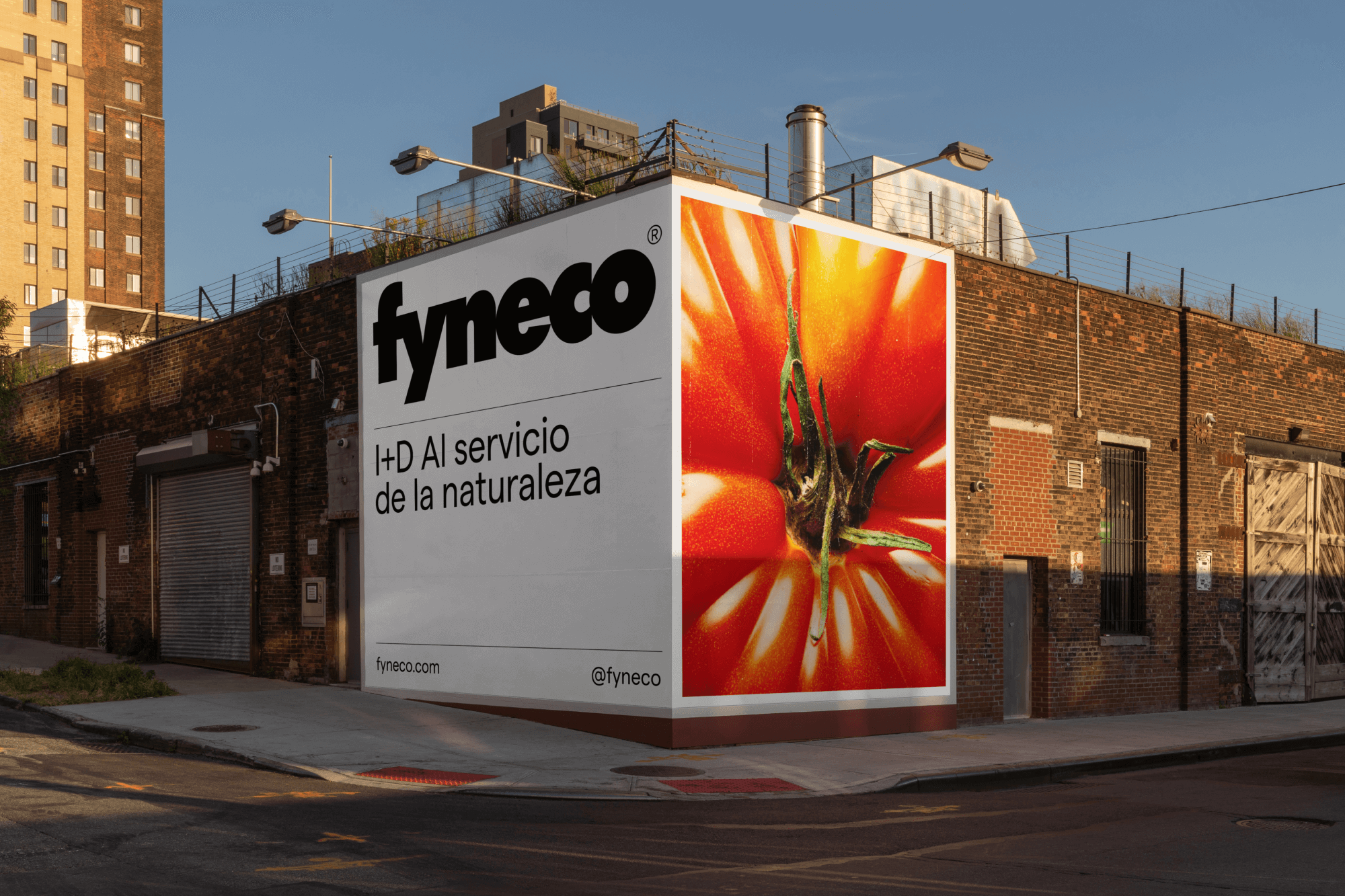
Fyneco, a fertilizer company in the agricultural sector, faced challenges in helping consumers identify and trust its wide range of products, due to unclear categorization and presentation. To establish a coherent identity and strengthen its market presence, Fyneco turned to our team for a complete brand transformation.
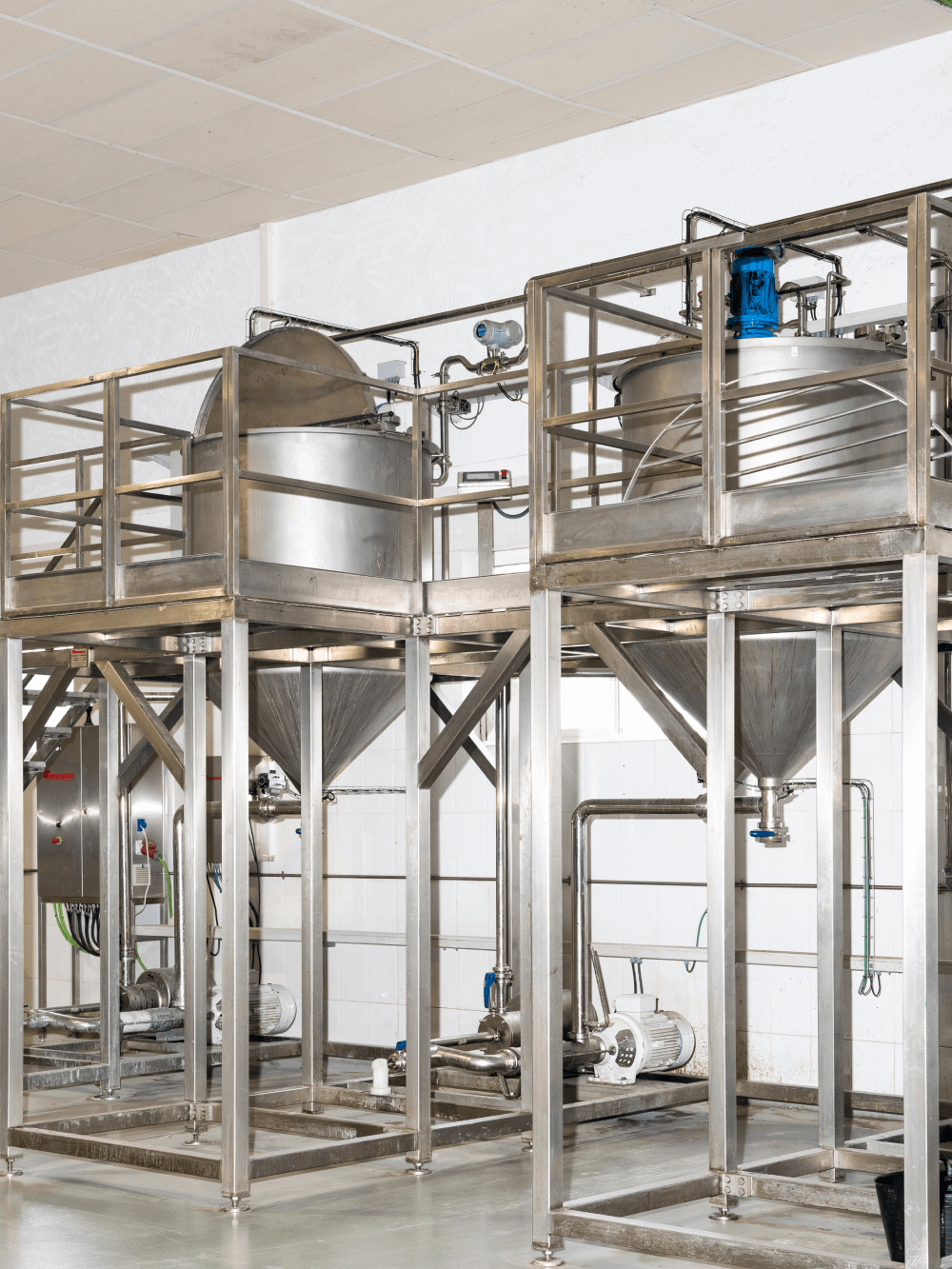
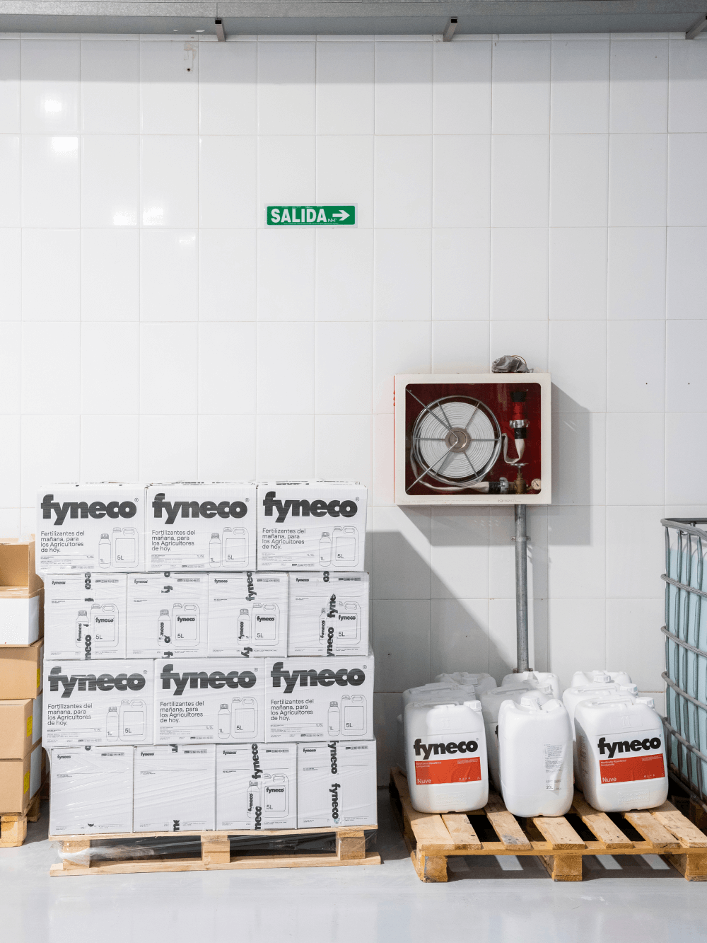
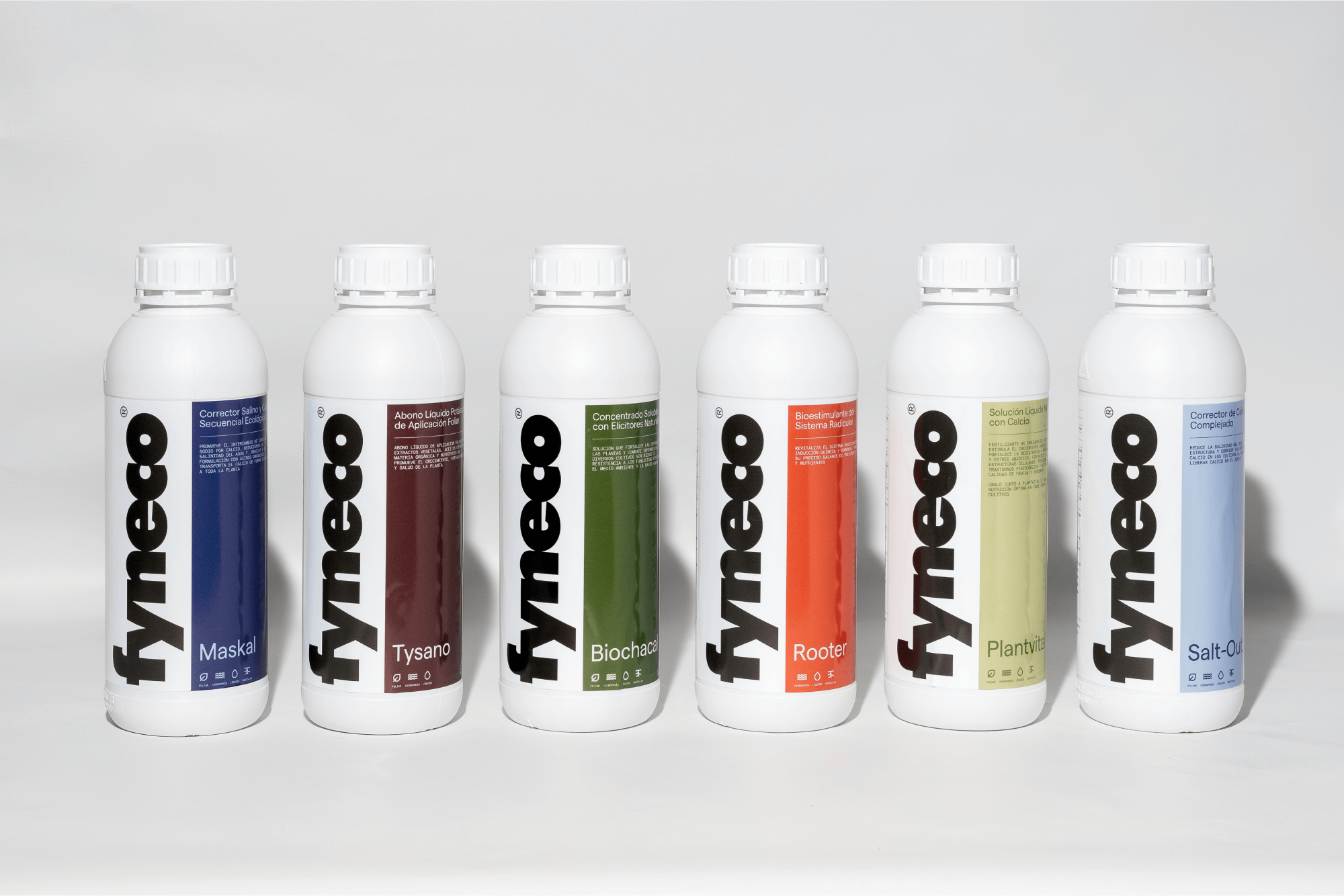
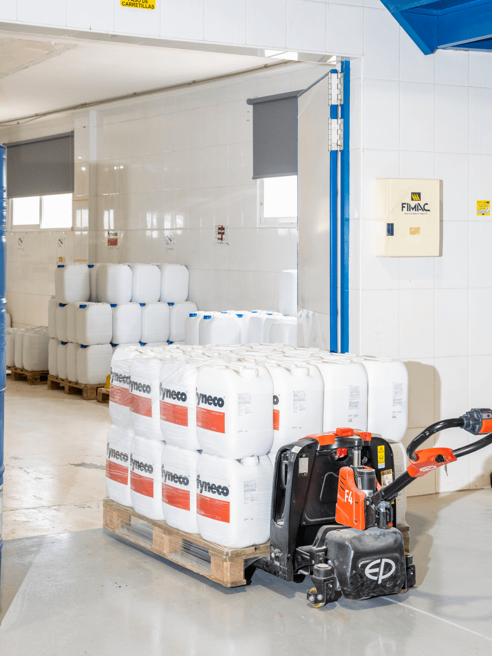
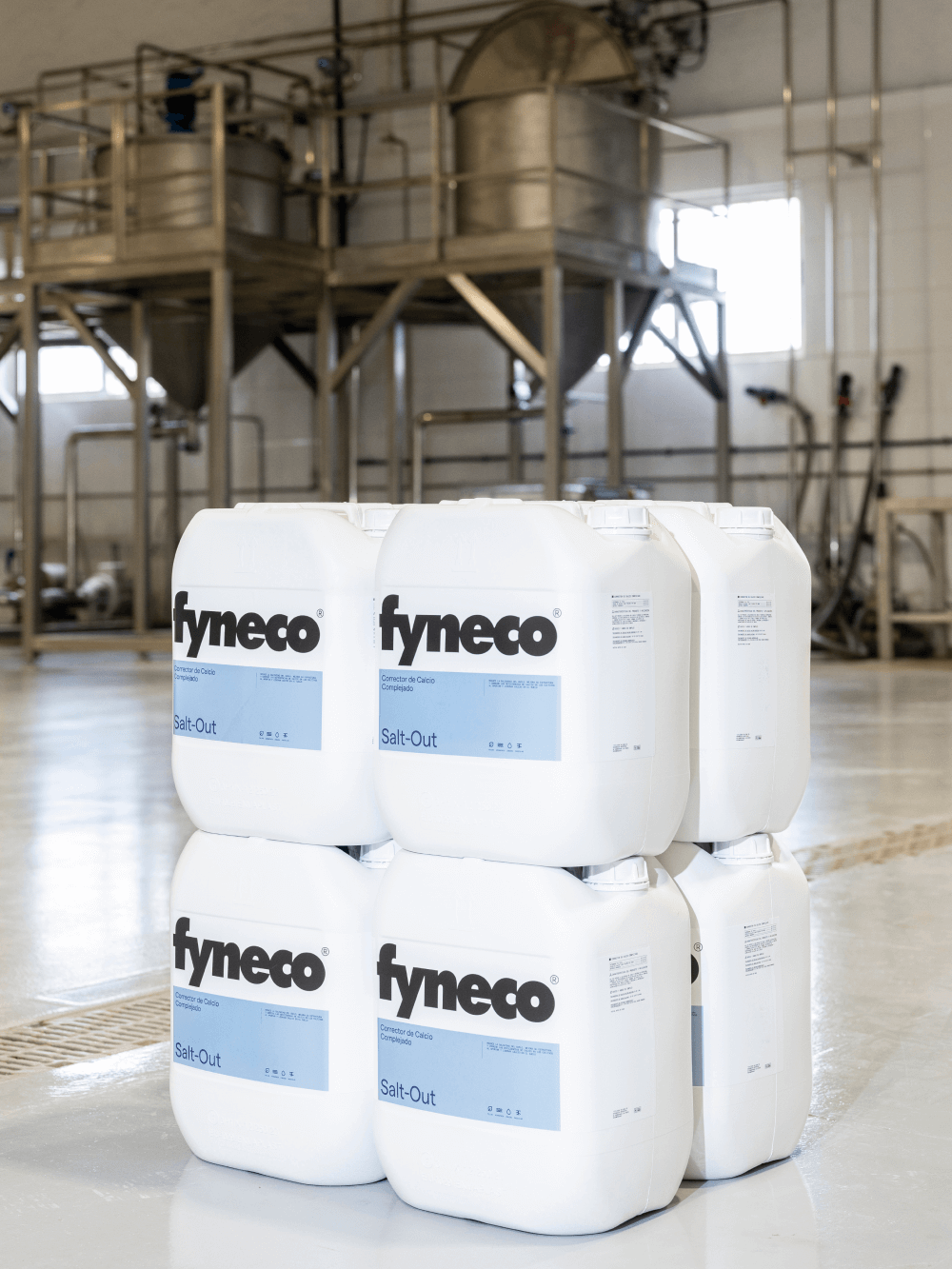

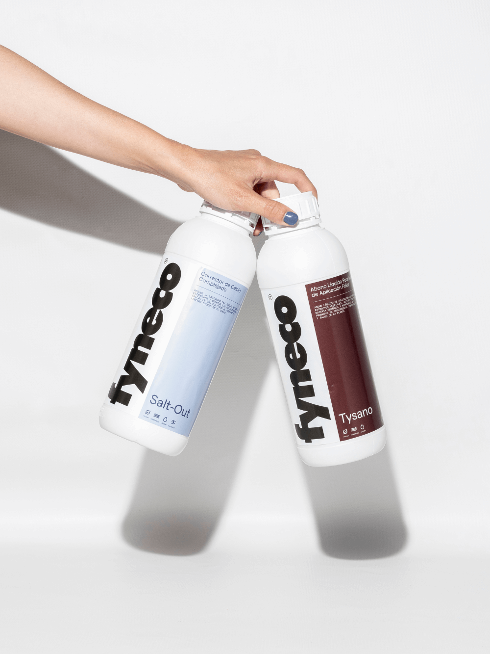
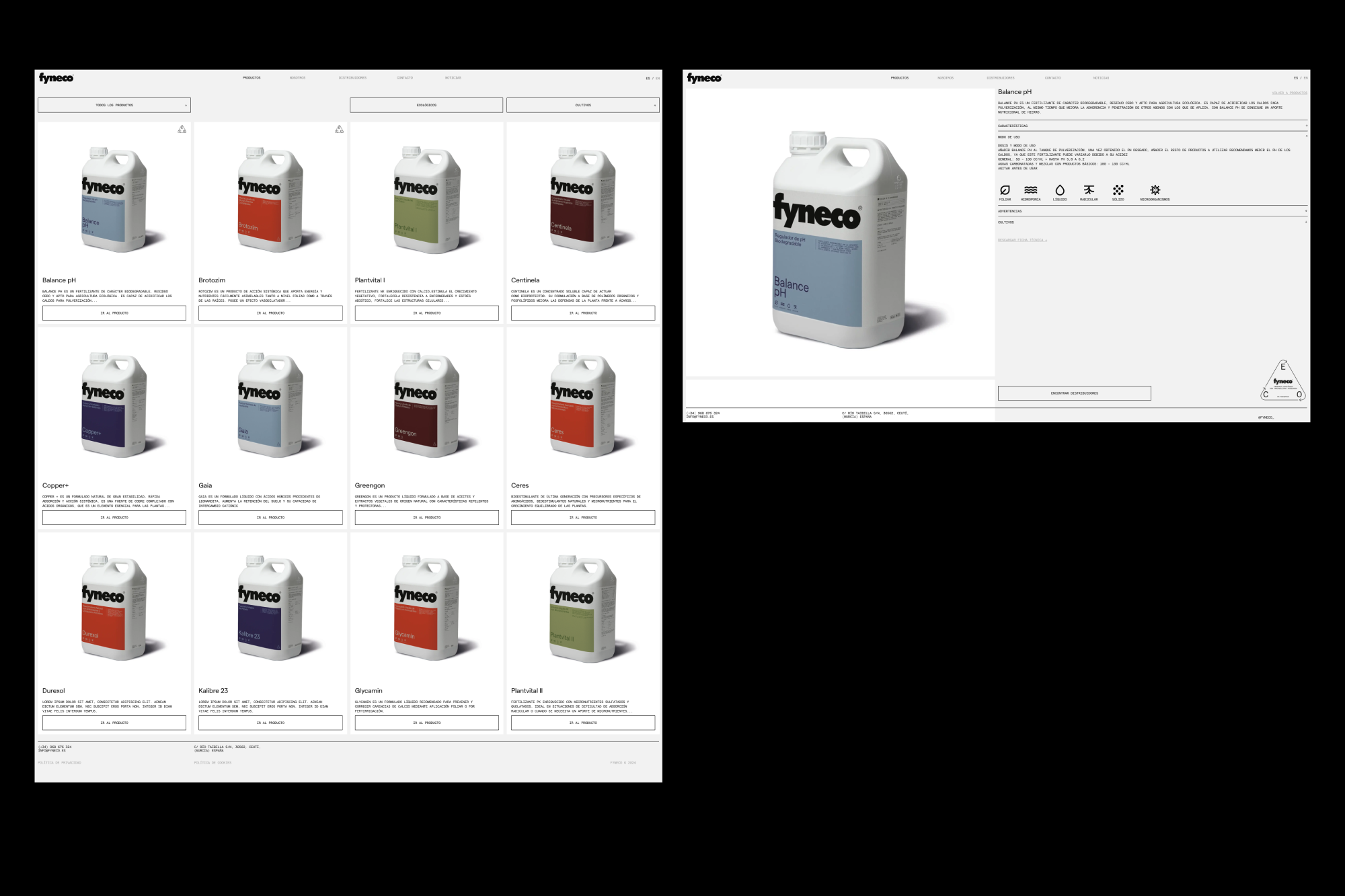
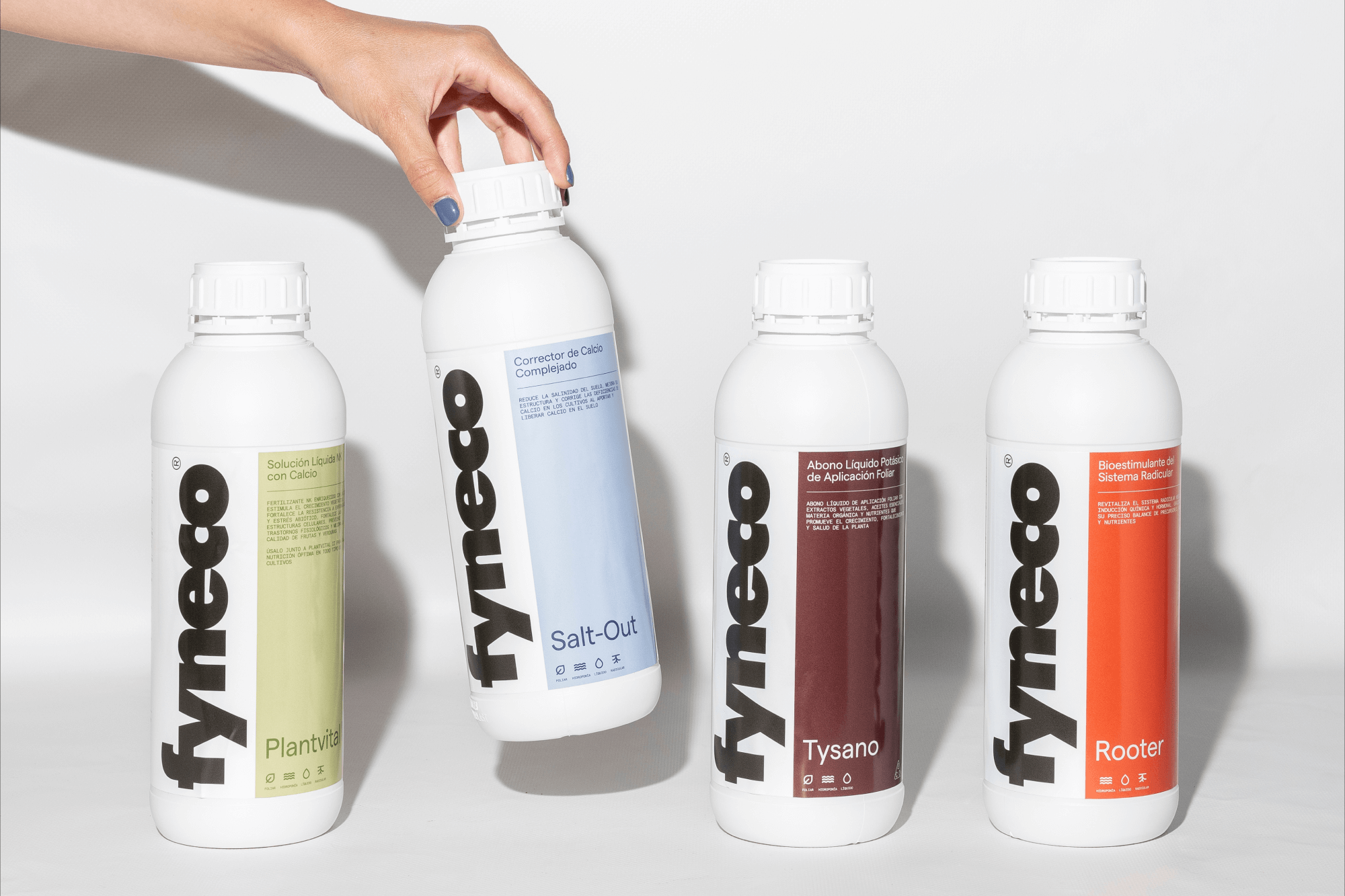
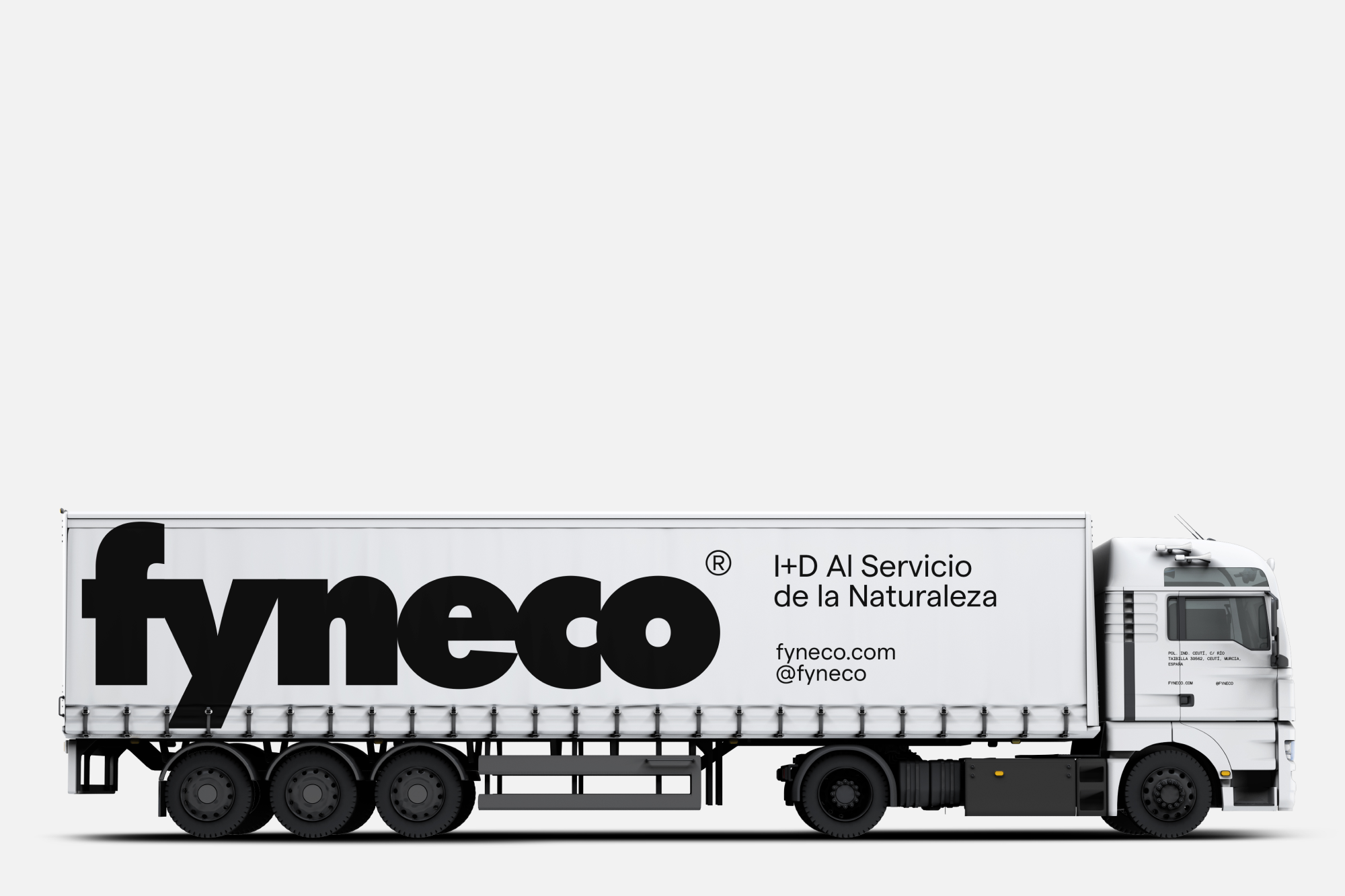
Guided by principles of functionality and purpose, we developed a new visual identity that prioritizes clarity and cohesion. We designed a strong logo that conveys trust and professionalism, along with a distinctive visual system for each product category, using specific colors and icons to ensure the brand always stands out. Additionally, we streamlined the product range by reducing unnecessary variations, allowing for a flexible system inspired by Swiss design that enhances the user experience.
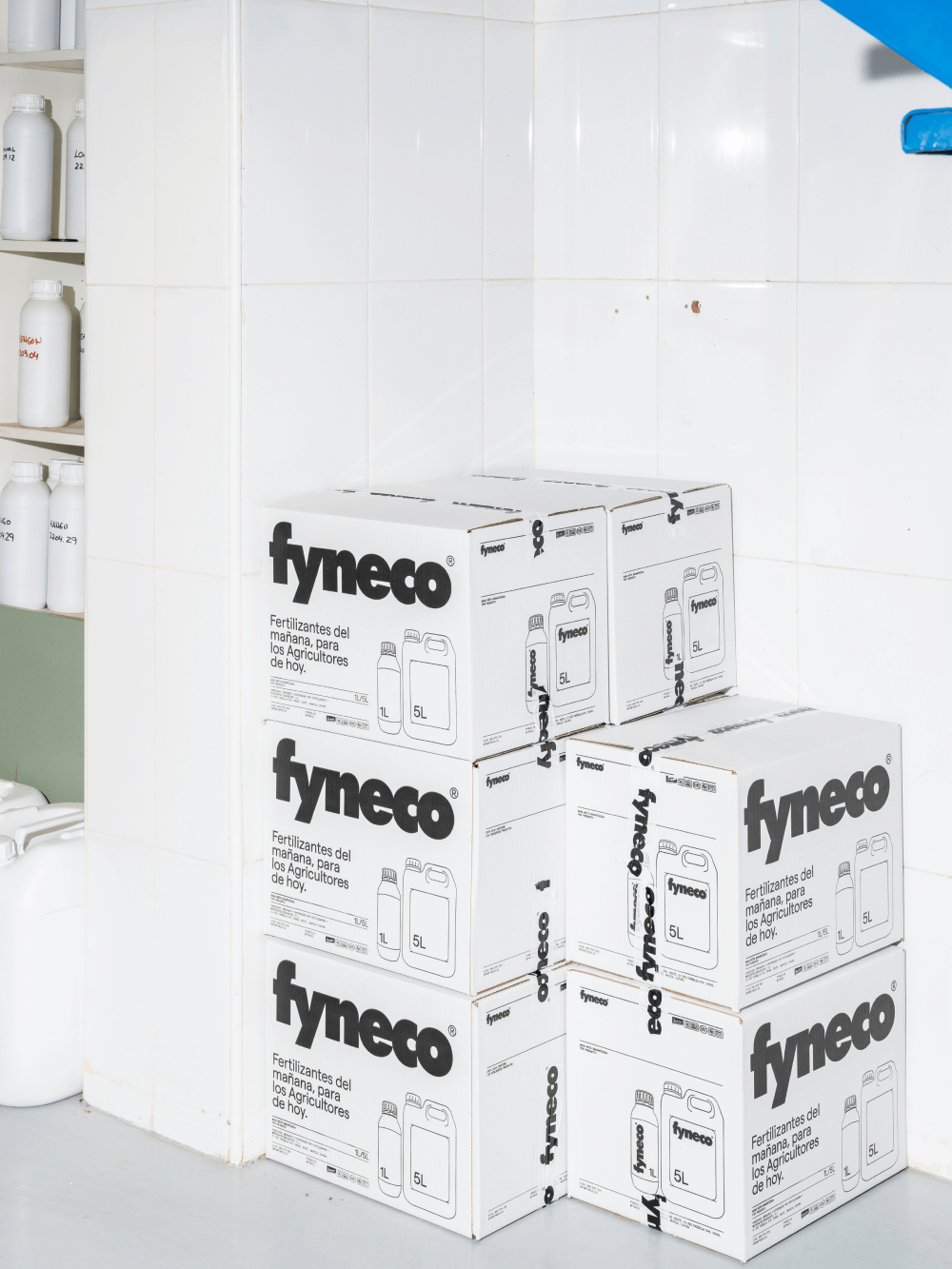
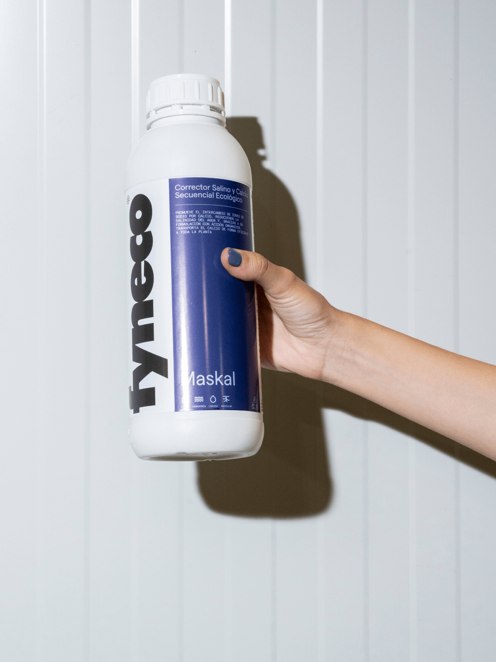

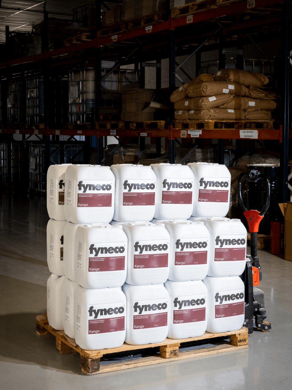

The packaging design focused on presenting essential information, such as dosage and chemical composition, in a clear and accessible manner, reflecting Fyneco’s quality and functionality. Through a masterful execution of typographic hierarchy and graphic accessibility, we achieved the perfect balance between aesthetics and usability. The typographic system we developed ensures consistency across the entire product line, enabling efficient packaging creation for future launches and becoming the backbone of Fyneco’s new identity.
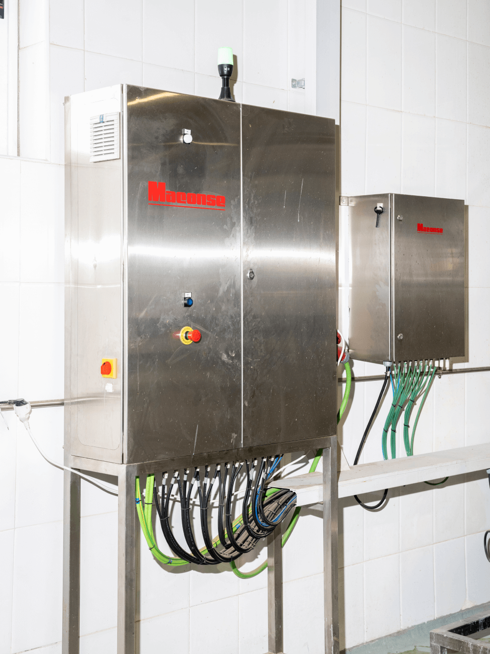
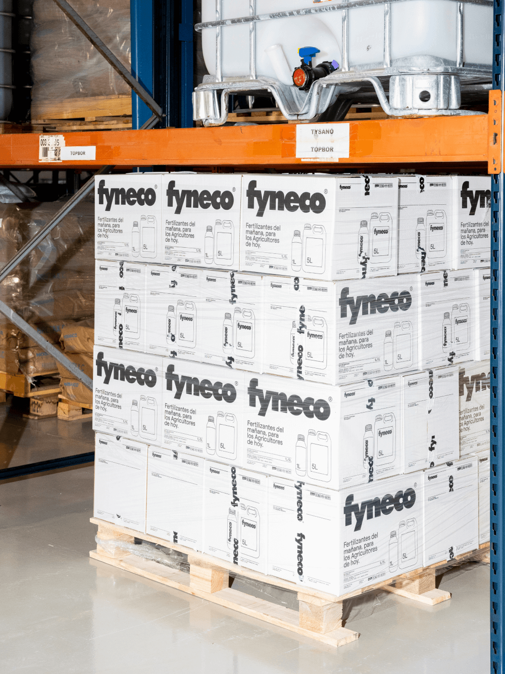

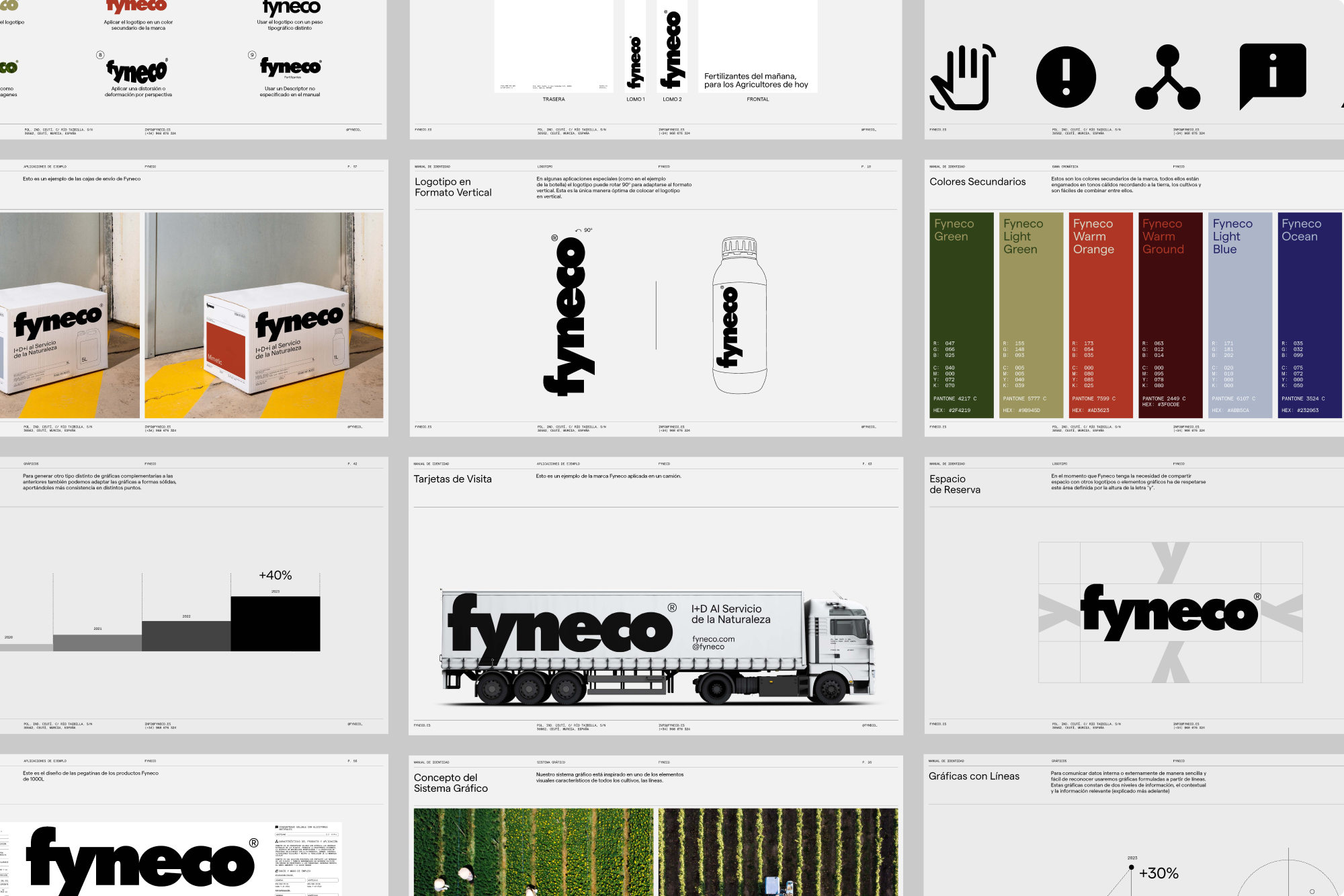
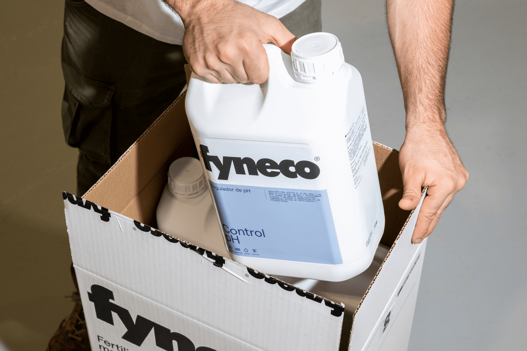
The rebranding has significantly transformed Fyneco’s market perception, boosting farmers’ confidence in their products and raising its profile as an innovative leader in the agricultural sector. With a cohesive and attractive visual identity, Fyneco has not only improved the presentation of its products but also strengthened its overall positioning, standing out in a competitive market and effectively communicating its value.
