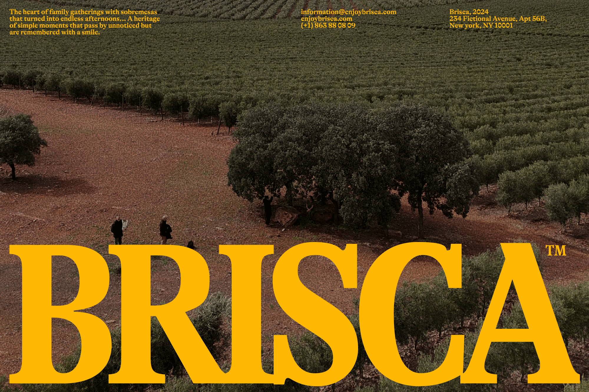
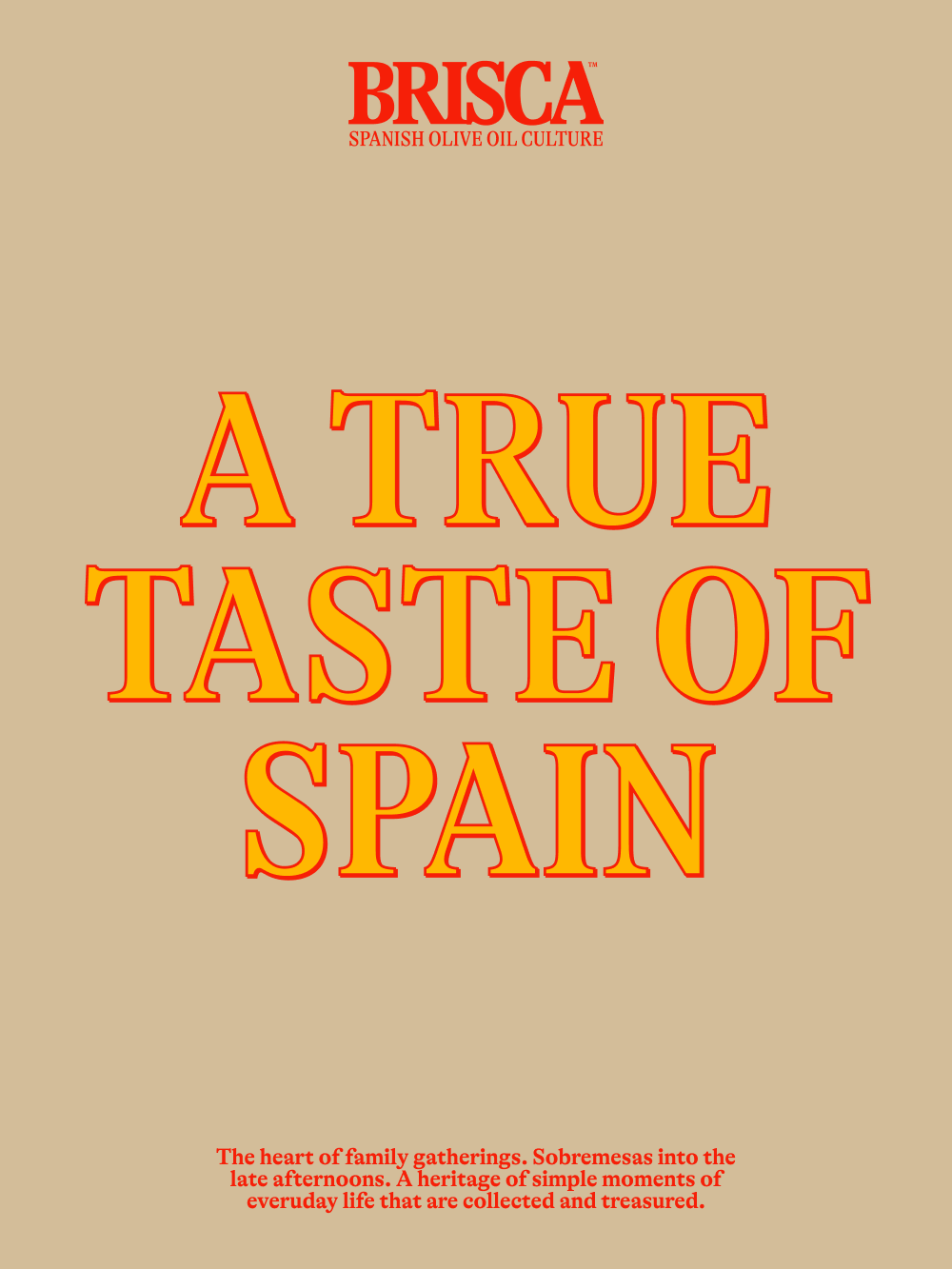
Sometimes, a brand is born from a simple emotion: the need to feel close to home. Brisca emerges from that nostalgia and from one clear question: how can the essence of Spain be brought to a country as different as the United States?
That’s when Sandra appeared — a Spanish entrepreneur who, after more than ten years living abroad, still missed long sobremesas, unhurried conversations, and the Mediterranean way of life. She wanted to create an olive oil brand capable of capturing that culture without falling into stereotypes: something authentic, contemporary, and deeply Spanish.
At Onmi Design, we developed the naming, visual identity, packaging, and art direction. From the beginning, our goal was clear: to bring a piece of Spain into American homes and restaurants seeking honesty, tradition, and a genuine culinary experience.
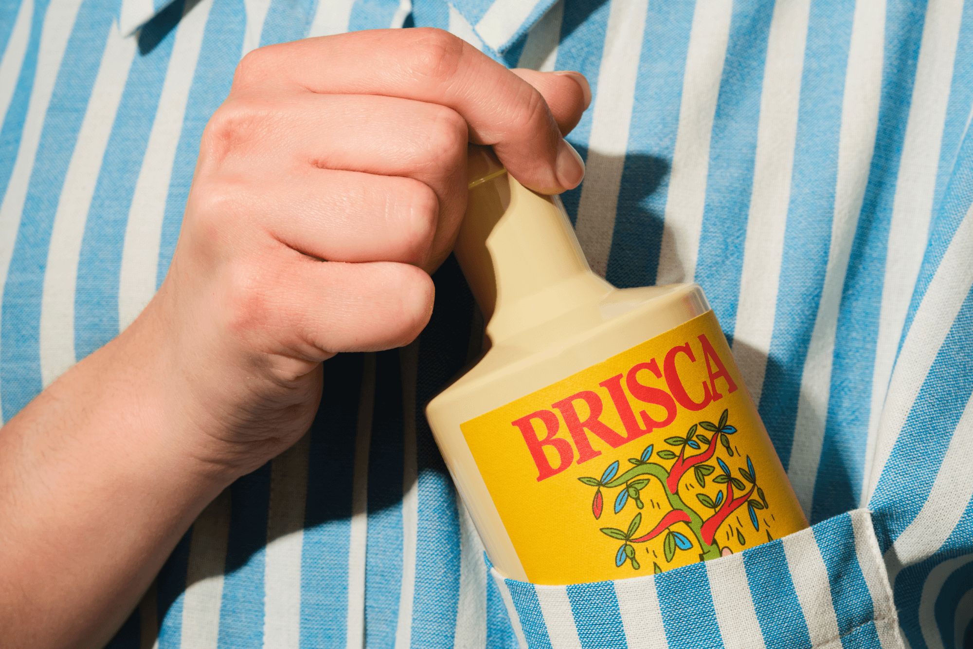
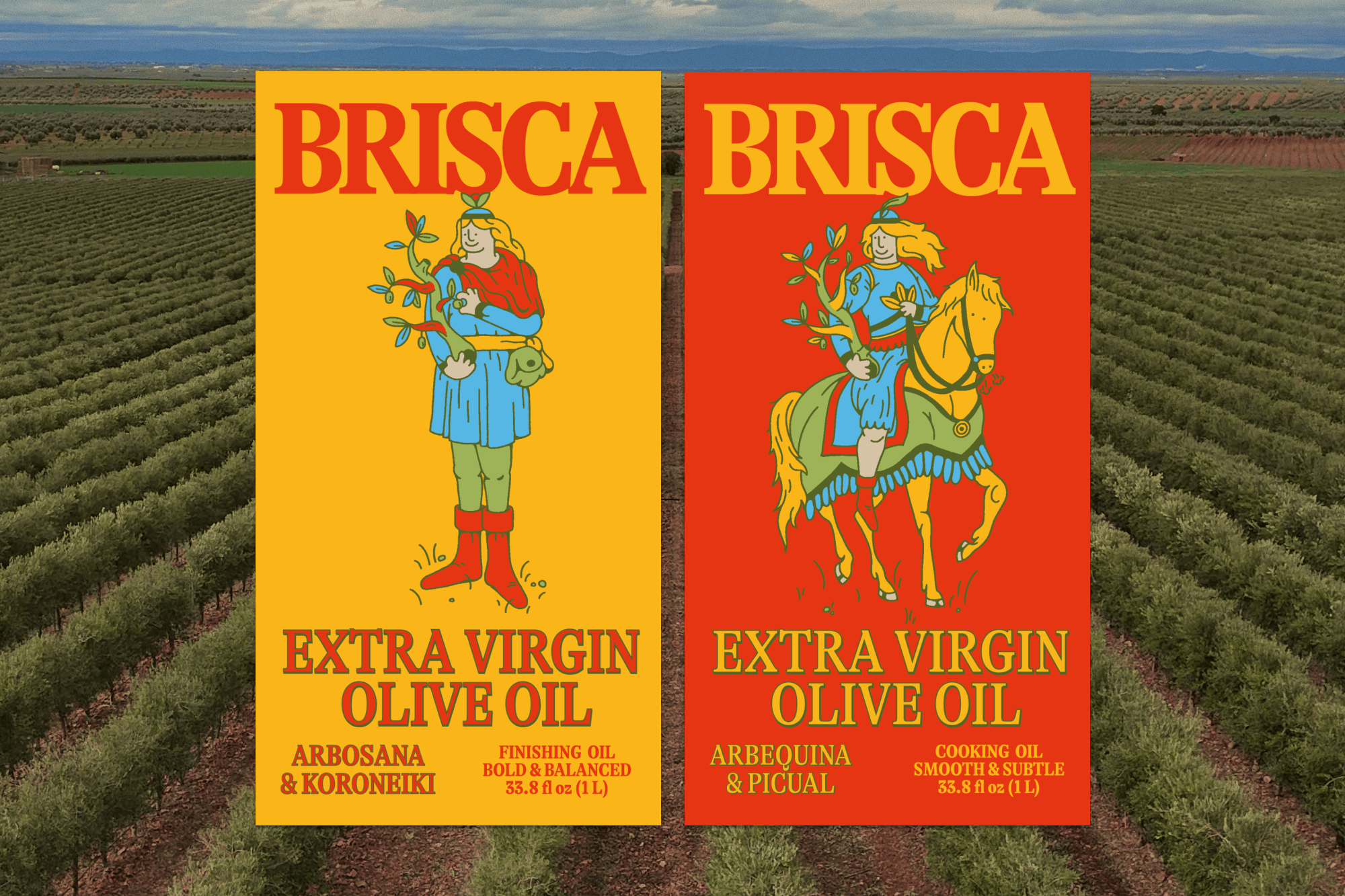
The name Brisca became the heart of the project. Inspired by the classic Spanish card game, it connects to shared memories, family afternoons, and the warmth of everyday moments. It was the perfect metaphor to express tradition, connection, and the joy of taking things slowly.
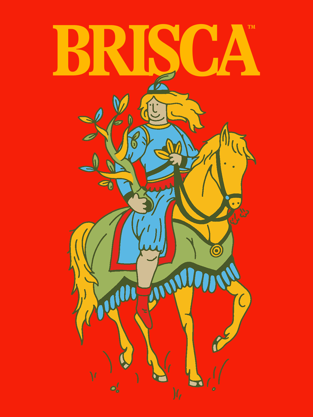
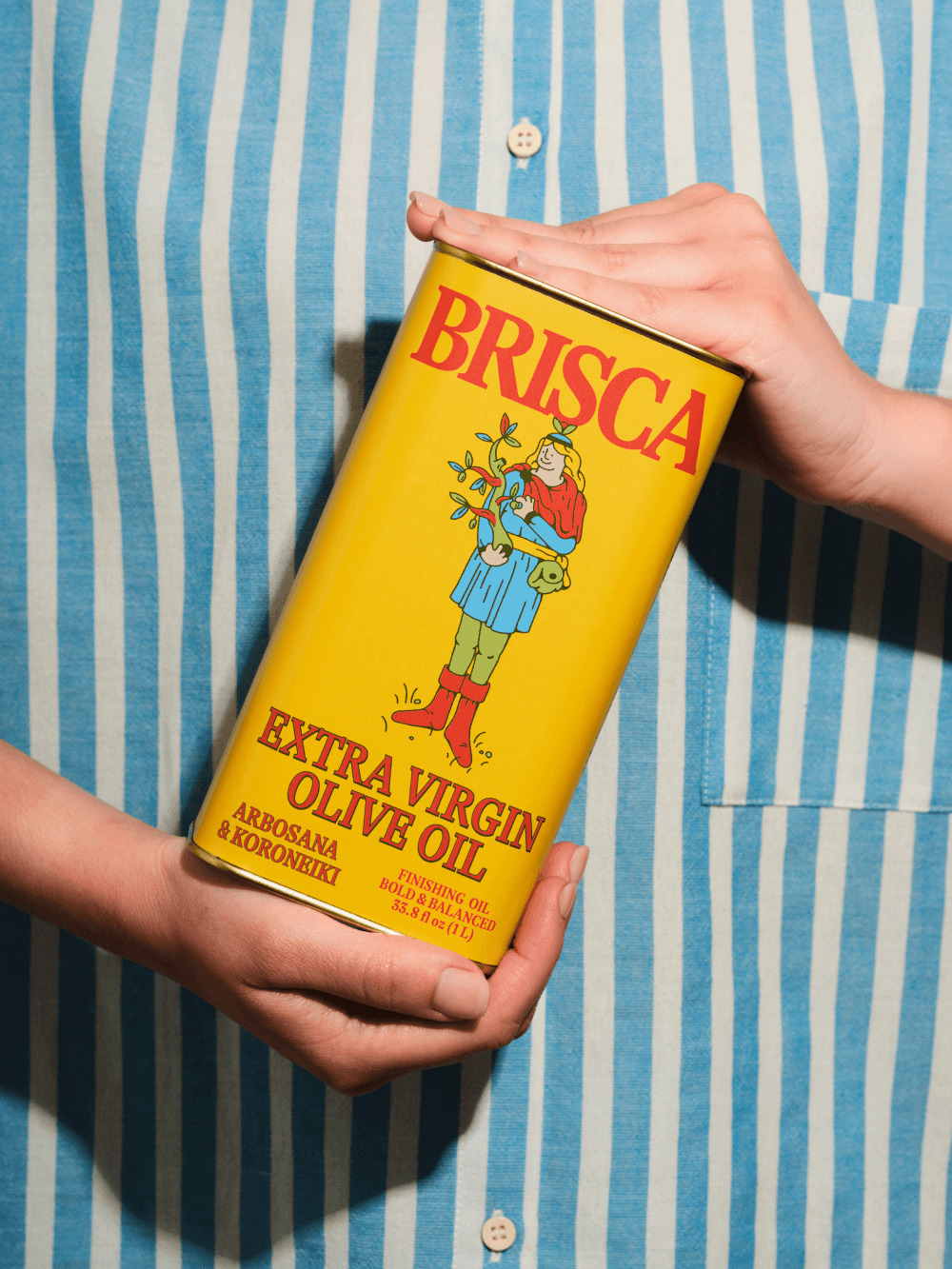
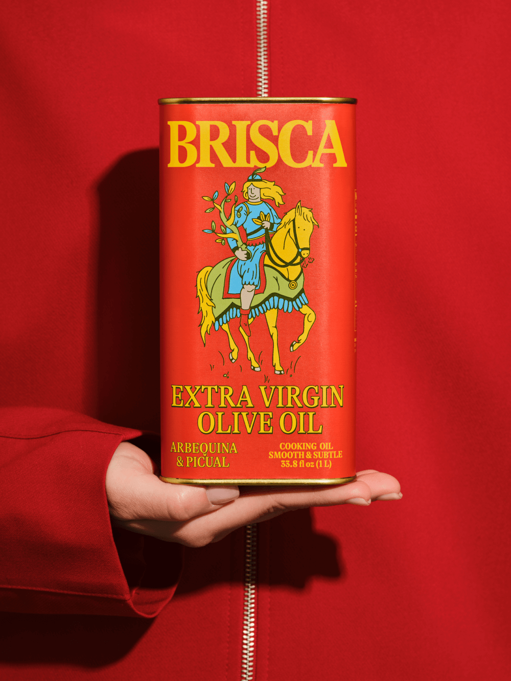
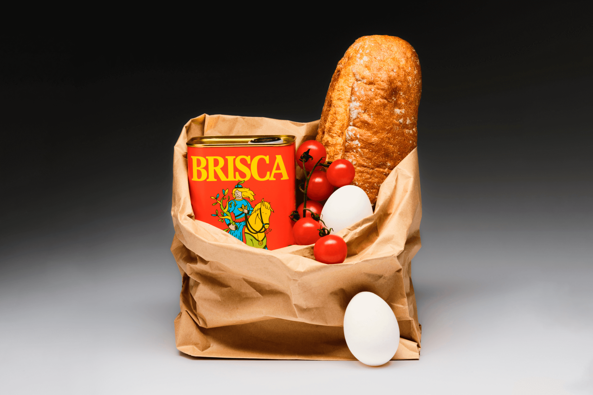

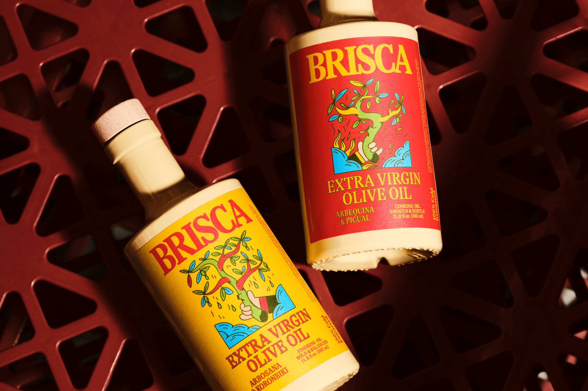
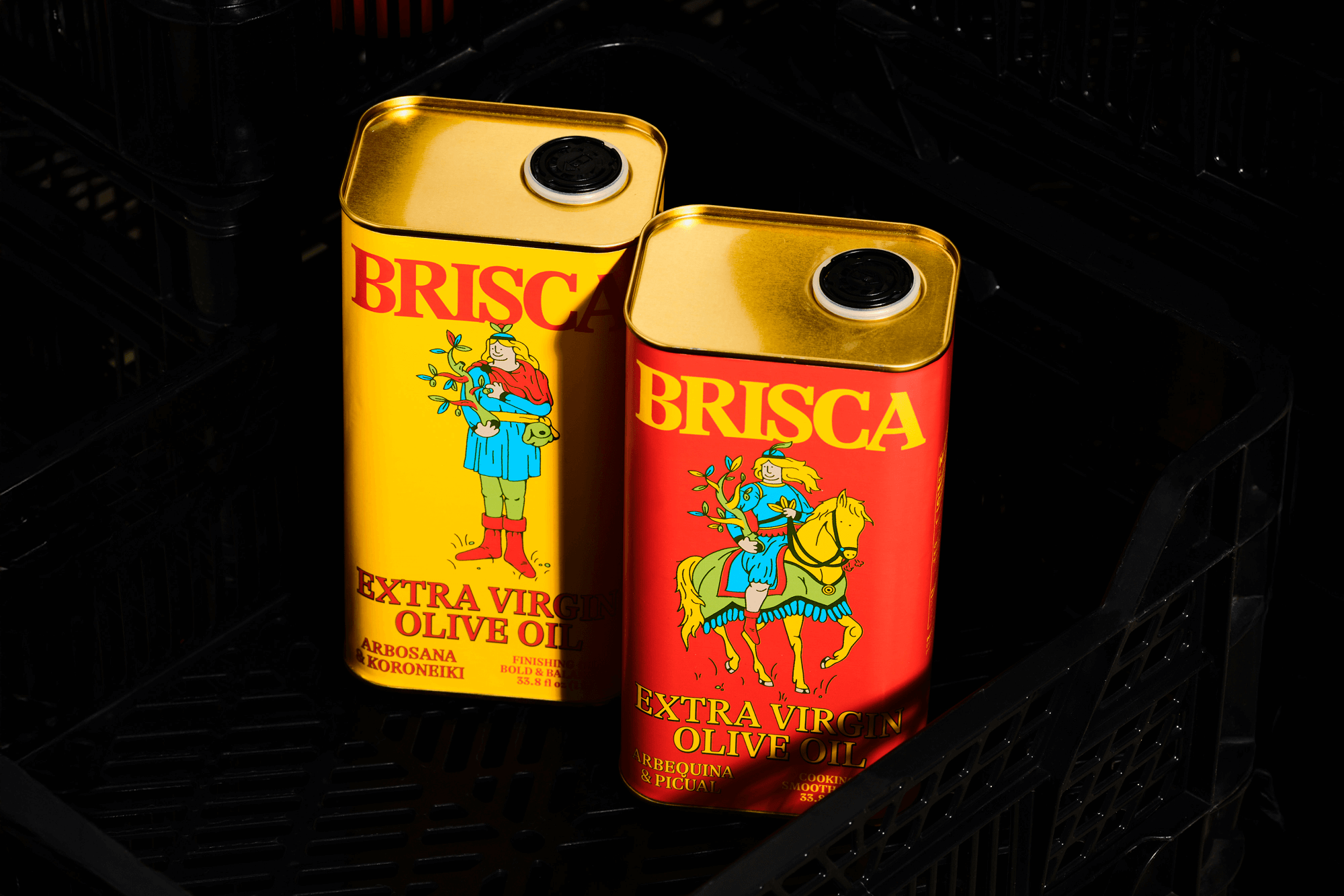
From there, we crafted a visual identity that blends heritage and modernity. The graphic universe draws from subtle references to the Spanish deck of cards, evoking familiar imagery without being literal. We wanted a brand that felt elegant, emotional, and resonant both in Spain and in the United States.

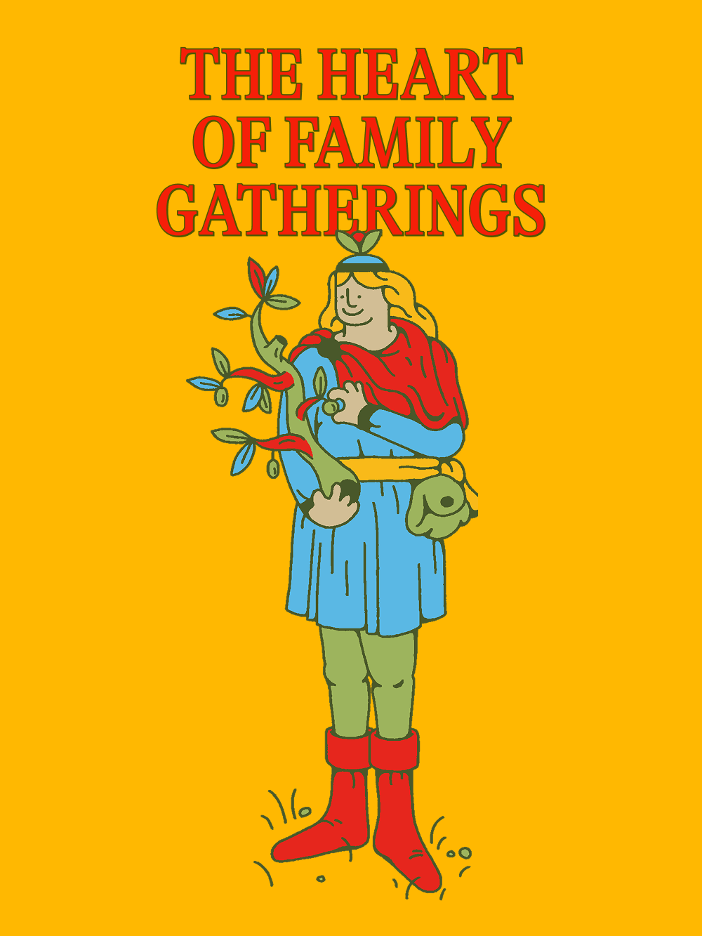
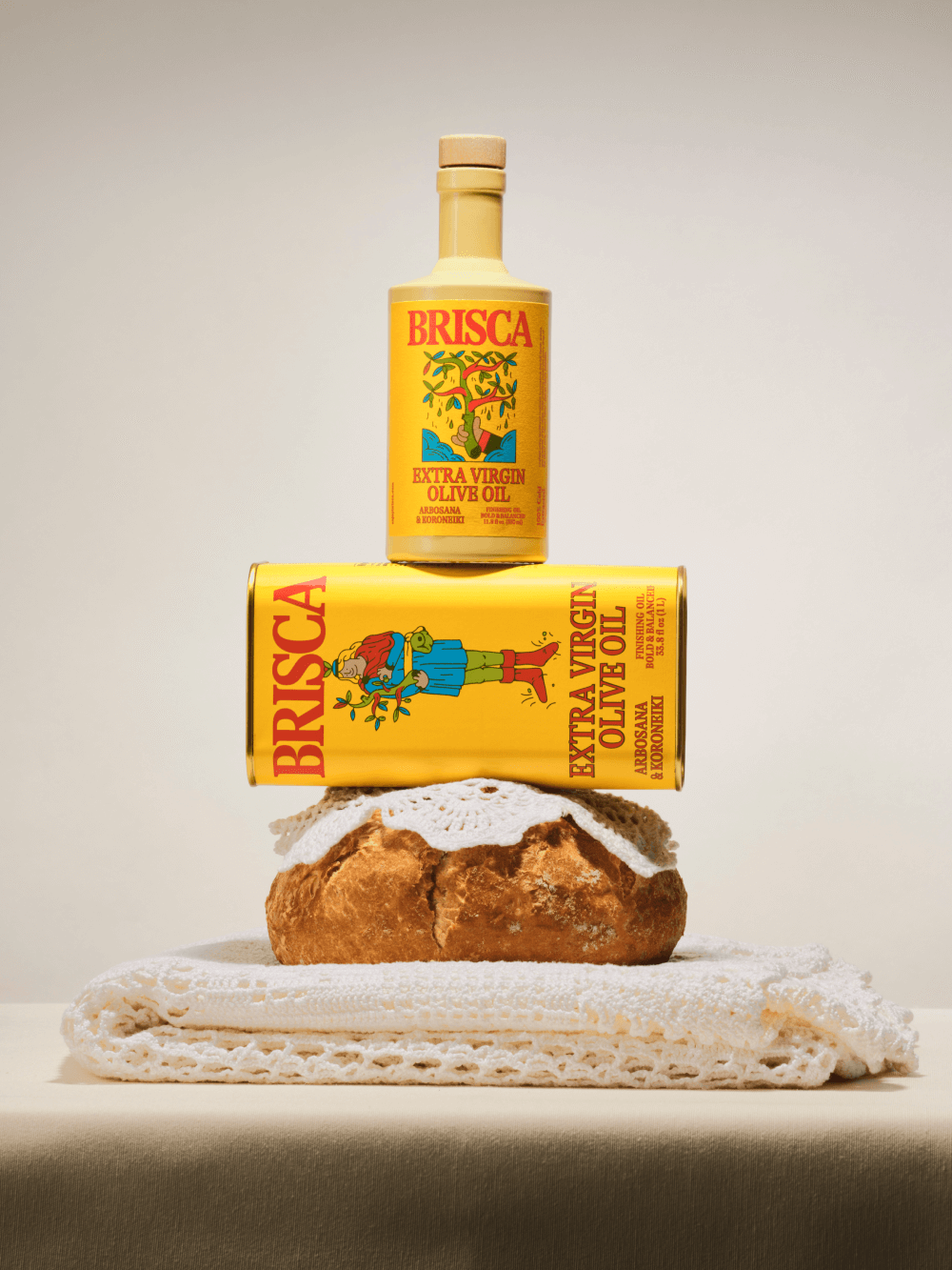
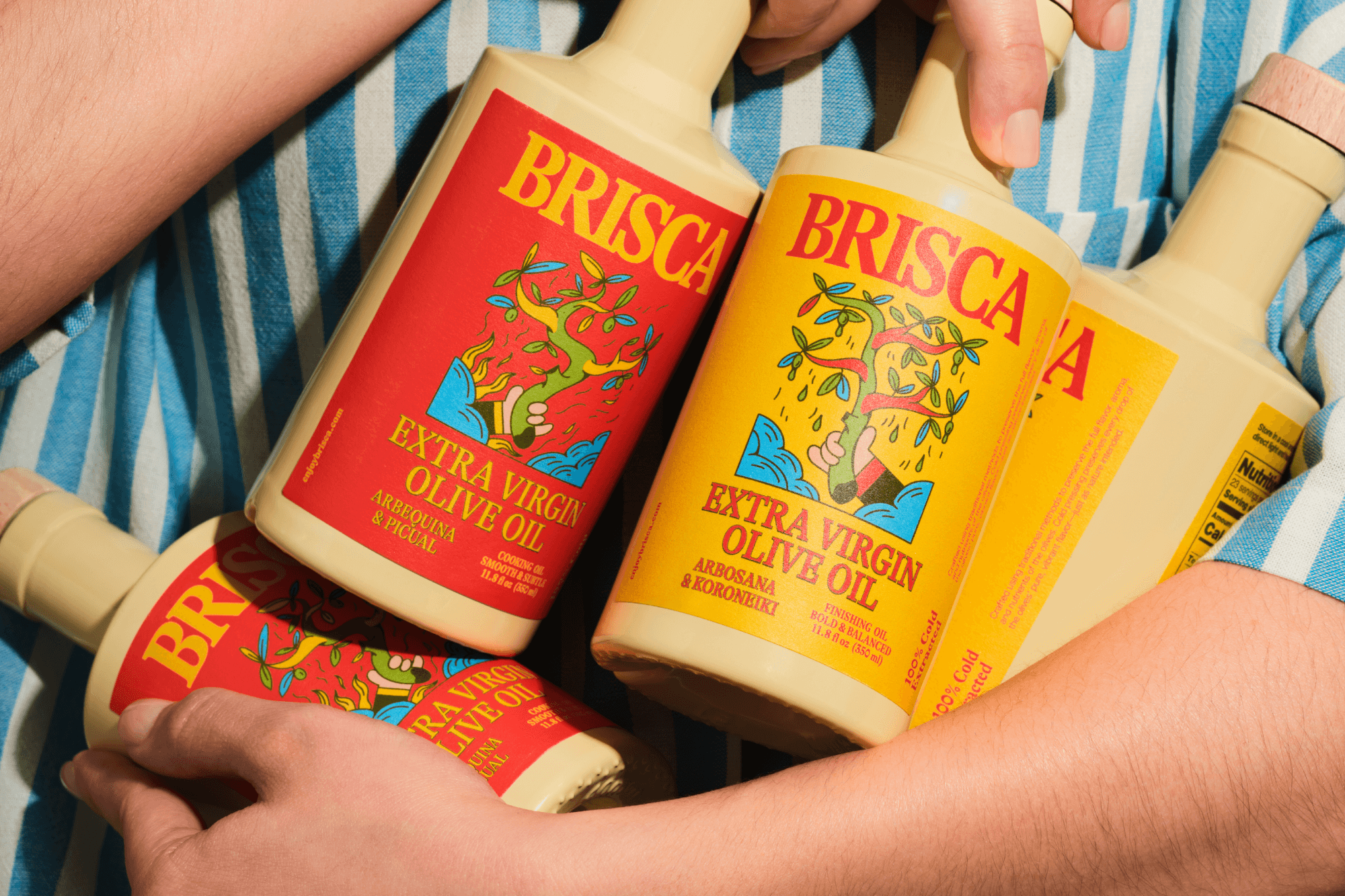
What we love most is the coherence across every element. The name, the identity, and the art direction speak the same language. Brisca is not just an olive oil; it’s a way of living. A celebration of tradition, gastronomy, and Mediterranean authenticity — translated into a contemporary, universal visual system.